

CDRC have recently replaced our venerable map website, CDRC Maps, with CDRC Mapmaker! This new flexible repository for visualising many of CDRC’s open datasets, was initially developed by Geolytix and further augmented by our own developers. The website is backed by the CARTO data platform and is cloud hosted.
Web mapping technology has come a long way since CDRC Maps was first released in 2015, with responsive, multi-platform high resolution mapping now commonplace, and CDRC wants to take advantage of these advances to create a better way of visualising our many datasets. Using a new platform also simplifies CDRC’s own processes for adding new maps, allowing our researchers to manage their map configuration using GitHub, and add and update their data using CARTO’s web-based front-end to its data platform. The “command line” is no longer needed to produce maps, and the power of the cloud ensures that our maps remain visible to the world regardless of university infrastructure changes or local issues.
Technical users might be interested to know that the website is built in ES6 JavaScript, using the Vue, Mapbox GL and Bootstrap frameworks, and built and deployed using npm and GitHub. The data is delivered to your browser in the Mapbox Vector Tiles (MVT) format.
The website is structured around presenting two types of maps – metric maps (which show various continuous variables associated with a particular dataset, sliced into groups) and classification maps which categorise areas into a single value (sometimes with a hierarchy of levels) and generally include a pen portrait description of the category.
Users can filter maps based on one or more classification categories or on multiple metric value ranges, and a PDF report can be easily produced with a view of the current map, a key and accompanying text and direct link. Clicking many of the maps will not only present the metrics or portrait, but include statistics on proportions in the current administrative area or a custom drawn region. The user interface is deliberately simple with standard pan/zoom controls, map selector, postcode search and layer toggles – that’s it.
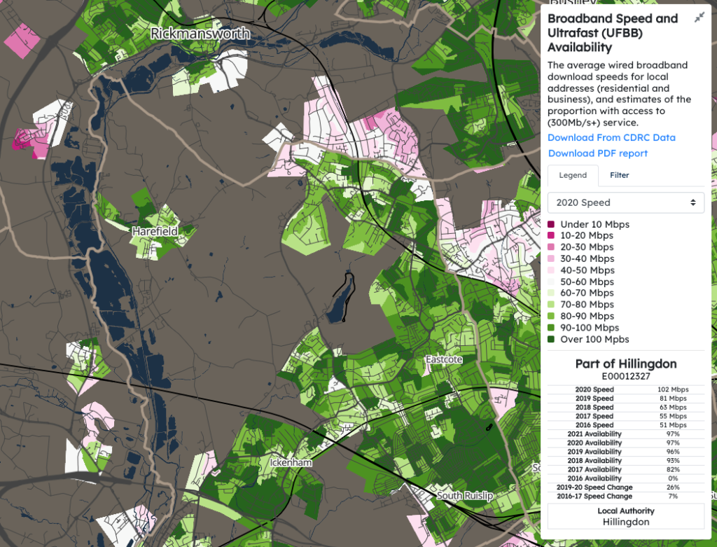
For our initial release of Mapmaker, there are around 30 maps, covering CDRC classifications such as Consumer Vulnerability and the Internet User Classification (IUC), CDRC metric products such as Access to Healthy Assets and Hazards (AHAH) and Residential Mobility (Churn), and some popular government datasets like the Index of Multiple Deprivation (IMD), VOA building ages and Ofcom broadband speeds/availability. Some of our legacy maps remain on the old CDRC Maps platform which can still be accessed through a special menu option.
We plan to continue to refine and improve CDRC Mapmaker, including a tighter integration with our main CDRC Data platform soon, and make fuller use of the CARTO data platform as a canonical data store for our outputs.
We hope CDRC Mapmaker forms a useful visualisation tool for some of CDRC’s many data assets, and its filtering and reporting functionality allow CDRC’s data to be viewed and used in new ways.