
Developing a micro-simulation model for COVID-19 in England
This project contributed to the creation, analysis and visualisation of a micro-simulation model tracking the spread of COVID-19 in an synthetic population.
Project overview
COVID-19 is a global public health concern, with more than 29 million known cases and 900,000 deaths (mid September 2020).
The Rapid Assistance in Modelling the Pandemic (RAMP) – Urban Analytics team is creating a micro-simulation model combining epidemiological models with urban analytics. This model can be used to understand disease spread and predict outcomes of different scenarios, such as the effectiveness of counter-measures.
Data and methods
The microsimulation model is build on demographic information from a synthetic population (developed by the SPENSER project). The synthetic individuals undertake various activities, including staying at home and going to shops, schools and work. This behaviour is based on data from spatial interaction models (where people are likely to go) and time use data (how much time people spend there).
People in the model can have 1 of 7 disease states, progressing from susceptible to recovered or deceased, determined by an epidemiological model. People with a given disease state may change their behaviour (e.g. stay at home when symptomatic) and/or increase the ‘hazard’ score of any venues they visit. For example, when an asymptomatic (infectious) person goes to a shop, this increases the likelihood that other susceptible people visiting this shop get exposed.
The model updates the disease status of people and the hazard score of venues every day, taking into account any countermeasures present at the time (such as local school closures). The model is usually repeated several times to average out noise. Different scenarios can be specified, such as local lockdowns or a gradual decrease in people’s adherence to countermeasures.
The internship project mainly focussed on the analysis and visualisation of the microsimulation model’s output. We computed several different output measures and visualised them in an interactive html dashboard using Python and Bokeh.
Key findings
We have developed a fully functional model for the County of Devon and tools to compare intervention scenarios for this region. Various outcome measures, visualisations and comparisons are available to help users spot temporal and/or spatial patterns in venue hazard and disease spread. Two types of dashboard are available.
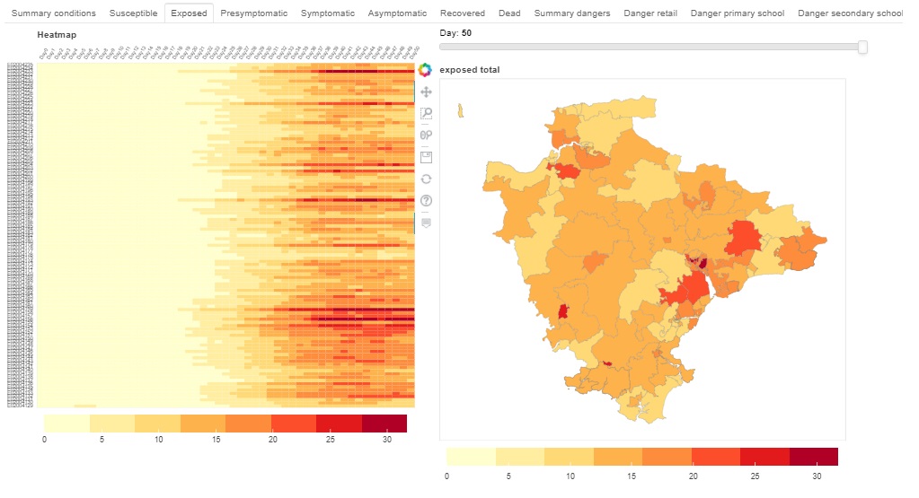
One dashboard provides detailed information on a given scenario. The two main variables are the number of people for each disease state and the hazard score of each venue. These are visualised across time and area (MSOA) as scatter plots, heat maps and choropleths (fig 1).
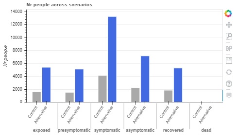
The second type of dashboard offers a high-level comparison between 2 or more scenarios. This includes bar charts summarizing the cumulative number of people for each disease state (fig 2) and average hazard score of each venue type, as well as time series data.
The exact model parameters and scenarios remain to be informed and validated based on the growing body of COVID-19 data and policies.
Value of the research
This model can be used to better understand how and why COVID-19 spreads, the population’s response and the impact of any countermeasures. An important goal is to create a clearer understanding of different exit strategies from lockdown and the best response to future flare ups.
This can support policy insight and enhanced decision-making, guiding the UK’s response to the COVID-19 pandemic.
“Estimating the impacts of COVID-19 at a local level are essential. The work in this project has brought us closed to having a tool that can not only help us to understand the spread of the disease, but also allows us to experiment with policy scenarios that could help to prevent its spread.”
Dr Nick Malleson, Professor of Spatial Science, University of Leeds
Insights
- Integrating urban analytics and epidemiological methods offers a way to combine human behaviour with disease dynamics
- Interactive dashboards are a useful starting point for analysing large and complex output data
- Combining spatial and temporal information in a single visualisation can be particularly useful to spot emerging patterns
Research theme
Urban analytics
People
Natalie Nelissen, data science intern, LIDA
Nick Malleson, Professor of Spatial Science, School of Geography
Alison Heppenstall, Professor in Geocomputation, School of Geography
Partners
Rapid Assistance in Modelling the Pandemic (RAMP) – Urban Analytics team including Alan Turing Institute, Exeter University, UCL, Cambridge University and Improbable