Oliver O’Brien, CDRC Data Scientist and Senior Research Associate at UCL Dept of Geography, has published a visualisation of Department for Transport traffic counts by mode, for the morning rush hour for London, at http://vis.oobrien.com/trafficcounts/. Viewers can access raw counts data over the last 15 years, for several thousand measuring sites in the capital, and see how volumes and mode share have changed, on a street-by-street basis, as the capital’s commuting patterns continue to evolve. A detailed description of the interactive map is at http://oobrien.com/2017/03/evolution-of-londons-rush-hour-traffic-mix/. The CDRC is looking to expand its coverage and work of transport-related consumer datasets, and is working with local councils to help analyse and visualise their transport-related datasets. The work was featured in a recent article published by Wired: http://www.wired.co.uk/article/london-traffic-map-busy-congestion has has already led to expressions of interest from other potential data providers.
Uncategorised
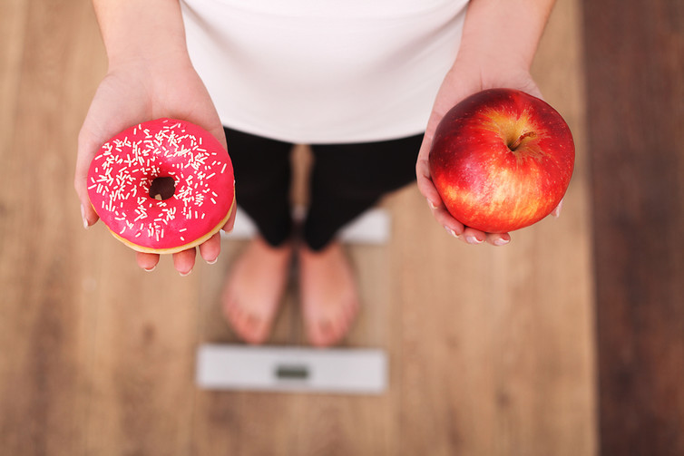
The online tool that can track, monitor and analyse nutritional intake
Janet Cade, University of Leeds
We all know that most people could improve the quality of their diet. Most of us do not eat the recommended five-a-day portions of fruit and vegetables – let alone seven or even ten, as some have suggested. Nor do we consume adequate amounts of oily fish. Instead, intakes are often too high in saturated fats and sugars added to foods and fruit juice, and too low in fibre and some key vitamins and minerals, including vitamin A and iron. A significant proportion of adults in both the UK and the US are obese or overweight. Intake of red and processed meat is too high, and meat consumption continues to rise in the US, the European Union and the developed world. Despite a shift toward higher poultry consumption, the largest proportion of meat consumed in the US is still red meat (58%).
There are serious implications for long-term health as a result of this disordered way of eating. To improve the situation we need to know how much energy and nutrients are being provided by our food. To help do this, we developed myfood24, an online dietary assessment tool that can support accurate, detailed recording of food and nutrient intake by researchers, but which can also support patients with diet-related conditions, sports enthusiasts, families with “picky” eaters and others. With data on 40,000 nutrients, it includes the largest and most complete food composition table in the UK, and possibly the world.
Monitoring intake
The size of portions and packaging has increased over the past 50 years, as has the number of products on supermarket shelves. This variety of choice makes it hard for consumers to even start to estimate how many calories or nutrients they might be consuming.
A new generation of smartphone apps offer users a chance to monitor their intake. However, there isn’t strong evidence that most of these are effective. Twenty-eight of the top 200 rated health and fitness category apps from Google Play and iTunes focused on both weight management and self-monitoring diets. When these apps were compared to people using a standard record of weighed food that they ate, the apps over- or underestimated energy intake by 10-14%.
But it’s not just consumers who are affected by inaccurate monitoring. Researchers, who base their studies on this kind of data, also encounter problems.
A major limitation of nutrition research is getting an objective measure of dietary intake. Misreporting is a big problem when people self-report their diet and is particularly common in overweight or obese people. Misreporting generally tends towards under-reporting of unhealthy foods and over-reporting of fruits and vegetables.
Metabolic profiling, which involves testing urine for the hundreds of metabolites that provide chemical signatures of food and nutrient intakes, doesn’t require self-reporting and may be a useful addition to self-reporting. A highly controlled study of 19 people fed four different diets found differences in metabolite concentrations. While this approach cannot replace the need to determine what actual food and nutrients have been consumed, it could be used as an objective measure to validate self-reports.
Understanding what nutrients are in the food we eat also relies on having comprehensive and up-to-date food composition tables – standardised national databases with accurate measures of many nutrients in typical foods. Standard food composition tables in the UK list around 3,000 food items, the majority of which are generic rather than branded (which more of us are likely to consume). While they include the full range of nutrients, they only include a limited selection of foods which are available for purchase.

Shutterstock
Pre-packed foods legally have labels with nutritional values. These include values for energy (kJ and kcal), and amounts of fat, saturates, carbohydrate, sugars, protein and salt. Further information can be included but is not compulsory for mono and polyunsaturated fats, starch, fibre, vitamins or minerals. If a nutrition or health claim is made on the packaging then the amount of that nutrient must also be stated.
Real time feedback
Developed with funding from the Medical Research Council, myfood24 combines the convenience of new technologies with an enhanced food composition table. Covering a wide range of generic and branded foods, it’s a quick and easy tool to help researchers, and potentially also clinicians, to track, monitor and analyse nutritional intake. We mapped the 40,000 nutrients from food label information and generic food data. To get an idea of the scale of this, the number of products on supermarket shelves is around 50,000 items.
The tool replaces the need for time consuming and costly coding of paper records that researchers and clinicians use. It means that people can record their dietary intake by selecting foods and portion sizes and adding them to their food diary. We hope this will support more accurate self-reporting, especially as users can be less self-conscious than when reporting to an interviewer. Researchers can then use results from this to find out in detail what foods and nutrients are being eaten. This data can then be linked to health outcomes or matched against recommendations.
Real time feedback of nutrients in foods could help us choose a more appropriately balanced diet over the week. Much as we have come to rely on regular visits to the dentist to ensure our teeth are healthy, the regular use of dietary monitoring could help us to ensure that our food and nutrient intakes are also healthy.
Janet Cade, Professor of Nutritional Epidemiology and Public Health, University of Leeds
This article was originally published on The Conversation. Read the original article.
Hiscox University Data Challenge
Lawrence Ning Lu, CDRC PhD Student, is leading a team from the University of Leeds in the Hiscox University Data Challenge.
The ‘Hiscox University Data Challenge’ sees three teams from LSE, York and Leeds Universities compete to solve real world problems, giving Hiscox the opportunity to tap into creative and analytical minds with a different viewpoint to those currently working in the industry. For the students, they get to experience real world problem solving, access to industry experts, networking opportunities with current graduates on the scheme and potential Hiscox sponsorship.
The Challenges
The team have completed the first challenge, which saw them modelling the causes of railroad accidents in America and identifying factors that may increase liability.
They have now moved on to the second challenge which asks them to consider what factors of success would look like for a start-up company. For instance, ‘is there a ‘Silicon Valley effect?’ Does the age of the CEO influence a start-up’s success and how?
The Experience
The team, which includes four students from our MSc Consumer Analytics and Marketing Strategy, recently visited Hiscox offices in York, to present the results of their first challenge to a senior team and also had the opportunity to network with the underwriters and analysts.

It’s not all hard work though, there was time for team bonding at Five Guys too.

Good luck to the team, we look forward to seeing their progress in the competition.
To find out more about Leeds Data Science Society, visit their website or follow them on Twitter.
CDRC’s Deputy Director James Cheshire wins National Travel Publishing Prize
CDRC’s Deputy Director James Cheshire has won the London Book Fair Innovation in Travel Publishing Prize in the 2016 Edward Stanford Travel Writing Awards for his publication ‘Where the Animals Go’
co-written with Oliver Uberti.
The book demonstrates how data and technology have changed our understanding of animal movement, and showcases the latest research and data visualisation techniques.
The scientific content, and focus on animals rather than humans, make the book very different from what readers may think of as travel writing, so it was a real surprise to James and Oliver that they were nominated for the prize in a shortlist of six. Well done James!
Commenting on the winners, Tony Maher, Managing Director of Edward Stanford Limited, writes:
“As the world grows smaller and in many cases more dangerous, travel writing in all its forms keeps us in touch with our global family. These disparate shortlists have one unifying feature – they are all marvellous examples of what travel writing and publishing does best, which is to show the reader a world far from our own doorsteps, made reachable by these glorious, powerful and unforgettable books.”
CDRC’s Dr James Cheshire will be speaking at Data Science Festival
Dr James Cheshire will be speaking about Spatial Analysis at this years Data Science Festival on 29th April.
The Data Science Festival is a free, week long, annual, celebration of all things data science. The festival consists of lectures, workshops, demos, code sprints, panel discussions and social events, spread across London and runs from 24 to 30 April 2017
Further details here: http://www.datasciencefestival.com/speaker/london/2017/james-cheshire/
The Meetup page: https://www.meetup.com/Data-Science-Festival-London/events/237959852/
UCL will be hosting the next London R workshop and networking event
The timings for the 28 March event will be:
- 2.30pm – 3pm – Registration of workshop attendees
- 3pm – 5.30pm – Workshop in DLT
- 5.30pm – 6.20pm – Registration for evening meeting and arrival networking drinks in rooms B05 and B15
- 6.20pm – 8.00pm – Presentations in DLT
- 8.00-9.30pm – Networking drinks in rooms B05 and B15
This workshop is free but spaces are limited; please request a place in advance via email to [email protected]
Shop Direct deliver guest lecture on MSc Consumer Analytics and Marketing Strategy
Students on our MSc in Consumer Analytics and Marketing Strategy were delighted to receive an interactive and informative guest lecture delivered by three speakers from Shop Direct. Shop Direct are the second largest pure play digital/e-commerce retailer in the UK and are the company behind the Very.co.uk and Littlewoods.com brands. We were joined by Tony Birch (Business Modelling Manager) and Nicola Dunford (Data Scientist) from their data science and analytics functions, and Louise Utton (Talent Partner) from their HR team. They introduced Shop Direct and their target customer demographic, ‘Miss Very’.
Tony and Nicola gave an excellent overview of the analytics, data science and modelling functions across their business and brands. They gave a clear distinction between day-to-day analytics and reporting versus larger scale innovative data mining and model building. They outlined the use of self-service systems to enable colleagues from across the business to access routine data (e.g. product sales) and gave specific examples of some of their larger model building projects, particularly in relation to assessing their marketing campaigns. They also discussed some of their novel ‘user experience’ and lab testing, all carried out in-house.
Louise introduced students to the working environment at their ‘Skyways House’ Head Office in Liverpool, including their new training and wellbeing venue ‘The Cube’, and discussed the MSc Dissertation Projects that Shop Direct are offering as part of the CRDC Masters Research Dissertation Programme. Students commented incredibly positively on the usefulness of the session and a number of students have been in further contact with the team in relation to MSc projects and future careers.
Guest lectures are an exceptionally important part of our MSc in Consumer Analytics and Marketing Strategy, giving students direct exposure to the application of their skills in a commercial setting. The interactive nature of this lecture enabled students to have a direct dialogue with managers and data scientists at Shop Direct. We very much look forward to welcoming Shop Direct back for further guest lectures in the future and hope that a number of our students will explore further opportunities to work with Shop Direct.
Webinar: Bringing new forms of data to the study of cities
This introductory webinar is for anyone with an interest in computers, cities and data. Participants learn about the explosion of new sources of data and about changes in urban cities that are currently taking place, as well as the main opportunities and challenges this represents. Special attention is paid to the need to re-think how we approach data in this new landscape to be able to reap the benefits without running into (already solved) problems.
Tableau Course Review – Nick Malleson
We will be running this course again on Thursday 22 February 2018 – find out more and book online.
I recently attended a 1-day course to learn how to use Tableau visualisation software, hosted by the Consumer Data Research Centre (CDRC) in the Leeds Institute for Data Analytics (LIDA).
On its website, Tableau says that it “helps the world’s largest organizations unleash the power of their most valuable assets: their data and their people”. The shorter version of that is, basically, that Tableau is software to visualise and analyse data. And mostly to visualise at that (for serious analysis you’re probably going to use something else like R or Python). But as for using Tableau as a data visualisation tool, I was very impressed!
The course took us through some examples of how to use Tableau for some increasingly difficult problems. These were interesting and a good way to get the handle of using the software, but I spent most of the time using it on some other data that I’m interested in at the moment. In particular, Leeds City Council have released a load of footfall data from a few cameras that they have dotted around Leeds, and I was interested in trying to look at the flows of people around the city.
It was easy to load the camera data in (just by dragging) and to link it to the camera locations that I had stored as a separate file. Tableau works out which columns represent coordinates and then lets you map the data. The screenshot below shows the camera locations, the the colour and size of the dots determined by the total footfall over the whole time period. The map is pretty rubbish at that scale, it is designed for regional or national mapping, but you can link to MapBox which will give you full control over the basemap. I didn’t do this, but imagine that it is a very useful feature (MapBox is great).

I then began to explore the changes in footfall over time, and this is when I was most impressed. Tableau parsed the time data properly (i.e. by not confusing dates and times for something like text), which was nice, but more importantly it made it incredibly easy to either look at trends over time (e.g. footfall per week over the last few years) or to aggregate to specific times (e.g. total counts on Mondays, Tuesdays, etc.). The figure below shows two examples of this. OK, you could do this with lots of other tools, but I was very impressed at how easy it was. There is also a ‘dashboard’ function that lets you combined plots and make images.

To summarise: I was very impressed with Tableau as a data visualisation tool. The one-day course is probably overkill for people who are fairly confident with modelling/visualisation tools already as it was generally pretty easy to use. But it was still nice to have a day messing around with some data. I don’t know what the price of Tableau is – as a lecturer I am lucky enough to have been given a free license – but if it is affordable then I would certainly recommend it as software to quickly do some useful visualisations of data.
Dr Nick Malleson is an Associate Profressor in Geographical Information Science and a member of the Centre for Spatial Analysis and Policy (CSAP) at the University of Leeds. His primary research interest is in developing spatial computer models of social phenomena with a particular focus on crime simulation.