Home » Uncategorised

Webinar: Scaling out community food organisations part 2

In the webinar, CDRC’s Professor Michelle Morris and Dr Rachel Oldroyd join colleagues from the University of Leeds and the Food Foundation to explore the takeaways and policy implications following completion of the project which produced 10 best practice case studies in the second of a two-series webinar.

The first one focused on the methods employed to identify and recruit priority places using The Priority Places for Food Index (PPFI). The University of Leeds in collaboration with Food Foundation has been leading on a project aiming to help understand how to scale up or replicate place-based, community-led food initiatives to increase their positive impact to communities, environment, and local economies across the UK.

How did those at high risk of Food Insecurity vote?

Polling Station Sign - How did those at high risk of Food Insecurity Vote?

How did those at high risk of Food Insecurity vote?

Election fever (and the new data it brings) has hit CDRC Leeds this last week. Dr Fran Pontin, our Senior Research Data Scientist, has been exploring the election results and how those identified as being at highest risk of Food Insecurity in our Priority Places for Food Index (PPFI) voted.  

How did those at high risk of Food Insecurity vote? by Dr Fran Pontin, Senior Research Data Scientist

We aggregated the neighbourhoods (lower layer super output areas) in England and Wales to their 2024 constituency and calculated the median PPFI decile for each constituency. We also calculated the median deciles for each of the seven domains that makes up PPFI:

  • Proximity to supermarket retail facilities
  • Accessibility to supermarket retail facilities
  • Access to online deliveries
  • Proximity to non-supermarket food provision
  • Socio-demographic barriers
  • Need for family food support
  • Fuel Poverty

Explore the full PPFI Index here.

What happened in the last election?

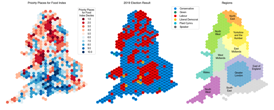
Votes for Labour in the 2019 election map fairly well onto the Priority Places for Food Index, where we identify the band of labour voters in the North West, North East, Yorkshire & the Humber and the West Midlands mapping onto Priority Places for Food Insecurity Support . However, there are constituencies where this pattern does not hold true, with more rural and coastal Priority Places in the South East and East of England voting Conservative in the last election. London also bucks the trend by being a Labour strong hold in 2019, which generally has fewer Priority Places (this is because London generally has better food access and performs better in the need for Family Food Support domain).

2024 voting behaviour in the constituencies most vulnerable to food Insecurity?

The Priority Places for Food Index considers both physical access to places where food can be purchased as well as the socio-demographic barriers to being able to buy food. The domains we typically associate with being more vulnerable to the impacts of the cost-of-living crisis, the socio-demographic barriers, fuel poverty and need for family support domains map most closely onto both the previous 2019 Labour voting patterns and where Labour have won seats this election.

One of the big stories of the election has been the swing of seats from conservative to labour. Looking at those swing seats we can see the constituencies that have swung tend to be at higher risk of food insecurity, when compared to the constituencies that have maintained a conservative hold. Suggesting that food insecurity and parallel concerns around the cost-of-living crisis were a major factor in voting choice in the 2024 election.

Mapping the changes in seats we see a trend that constituencies where Labour have won seats from the Conservatives typically tend to be constituencies at higher risk of Food Insecurity. These high-risk swing seats including more rural and costal areas in the South East, constituencies in Cornwall in the South West and West Midlands. On average Conservative voting constituencies tend to be at lower risk of Food Insecurity.

Whilst, where Reform UK have won previously Conservative seats also tend to be constituencies at higher risk of Food Insecurity, suggesting Food Insecurity and the cost of living may be a factor in the swing to Reform UK votes, despite the fact the manifesto ‘does not contain many measures that would ease food insecurity’.  Interestingly, the seats the Liberal Democrats have won from the Conservatives tend to be in areas at lower risk of Food Insecurity despite, as highlighted by the Food Foundation, policies to tackle Food Insecurity outlined in the Liberal Democrat Manifesto.

Individual voting decision is a very complex and personal decision, whilst Food Insecurity seems a strong predictor of a Labour vote, we will never know the full role to which policies to address Food Insecurity and the wider cost-of-living crisis have played in the electoral outcome.

Data Source and Thanks

Election data were taken from the UK Election Data Vault and the House of Commons General Election Results. With thanks to Alasdair Rae at Automatic Knowledge for the ‘Hex’ constituency maps.

Dr Francesca Pontin

Senior Research Data Scientist, Consumer Data Research Centre

Fran is a Senior Research Data Scientist at the CDRC Leeds, her research interests focus on characterising and reducing spatial health inequalities utilising secondary ‘smart’ data analysis and the development of open data products to improve the use of data in informing policy decisions.

Open Wide – Gaps in NHS Dentistry

Open Wide – Gaps in NHS Dentistry

Research from Dr Stephen Clark is improving understanding of NHS dentistry provision and highlighting areas in England most in need of additional support.

Recent research from Dr Stephen Clark published in European Journal of Public Health highlights areas in England most in need of additional NHS Dental provision.

The problem

Dentist advertising NHS appointments

As part of the National Health Service (NHS) residents in England have the right to visit a dentist for twice yearly check-ups and treatment. However access to this care is proving to be increasingly difficult.

The mainstream media regularly contains stories of individuals who are unable to get an appointment, have to make visits to A&E departments, travel 100’s of miles to find a dentist, carry out DIY treatments, or return to war zones for dental treatment.

Alternative provision is available in the private sector but this is usually many times more expensive than NHS care.

This is a bad situation because poor dental health can have both physical and psychological impacts on people’s quality of life and without check-ups opportunities to detect more serious illness, e.g. mouth cancer, are lost.

How is NHS dentistry provided in England?

Within England a dentist can agree to work to an NHS contract.

If they do then they will be contracted to deliver a set number of Units of Dental Activity (UDA) throughout the year and paid an amount of money per UDA by the government.

All NHS care are allocated to one of three bands and there is a set separate fee for each band, payable by the patient.

BandExample Care/Treatments NHS patient cost (2024)UDAs
Band 1Check-up; X-ray; Light polish£26.801
Band 2a to 2cFilling; Extraction; Deep de-scaling£73.503, 5 or 7
Band 3Crowns; Dentures; Bridges£319.1012

The patient pays the same irrespective of the number of teeth treated and only pays the highest fee appropriate, so an examination followed by some form of band 2 treatment costs just the band 2 fee, £73.50.

Looking at the population, in 2023-2023 there was the equivalent of 1.6 contracted UDAs per person available, which is less than is required to carry out twice yearly check-ups and does not allow any capacity for treatments.

What solutions could help?

Given this heightened concern over NHS care, policy initiatives have been proposed by various political parties, including the establishment of new dental clinics, extra provision at existing clinics or requiring newly qualified dentists to work in the NHS sector for six years.

Improving understanding of NHS dentistry provision through research

It is at this point that my research becomes relevant. It answers the questions as to where is the NHS provision currently poor?; and what will be the overall impact of adding extra NHS capacity in certain communities?

This is done by using a measure of accessibility.

An accessibility index measure should have the features that it should increase as:

  • the number of supply locations or care capacity increases
  • there is a lower amount of demand and competition
  • there is a reduction in the distance between patients and practices

An additional requirement is that there should be no detriment in dental care accessibility by the type of community.

In this study the demand for NHS dentistry is the 2021 Census population in the Lower Super Output Area (LSOA) (each has a population of about 1,600), the supply of NHS dentistry is the number of UDAs contracted to the practice, and the distance is the travel time by car between the LSOA population weighted centroid and the practice location postcode.

The calculations are made using the Modified Huff Variable 3 Stage Floating Catchment Area (MHV3SFA) approach.

This index of accessibility incorporates all the features that are highlighted above. In the calculations, an area with better accessibility to NHS care (more practices; little local competition for the care; or being close by) will have a higher index than one with poorer access (fewer practices; high local demand for care; or long travel times).

The details of this calculation can be found in the accompanying article.

Dental deserts

The figure below maps the accessibility index for the LSOAs in England. The areas with better accessibility and a higher index are in lighter shades, the areas with poorer accessibility are in darker shades. Additionally the 1% of LSOAs with the lowest accessibility are highlighted with a blue diamond and could be considered ‘dental deserts’. It is clear from this figure that urban areas have generally better accessibility to NHS dental care than the rural locations.

Figure 1 : Accessibility index for England

This figure identifies clusters of LSOAs that could be said to form dental deserts. Two are located in the East of England, in the Fenland and Mid Suffolk, others in the South Midlands and along the Welsh border, and finally in the South West.

If we zoom into the situation in the Fenlands as shown in Figure 2, we see some interesting features. Although the town of Wisbech in the centre of the figure has two dental practices, they are only contracted to provide 36,000 UDAs as part of their NHS contract. This means that some very close by neighbourhoods have a standard level of accessibility (the yellow diamonds), but others, still close by and some at a distance, have very poor accessibility.

The towns of Wisbech or March would be a top priority for extra NHS dental capacity. The MHV3SFA calculations could then be repeated with this extra capacity, and its impact on the accessibility for these LSOA could be evaluated.

Figure 2 The dental desert in the Fenlands

In the article a similar case study is presented for the St Pauls community in Bristol. Also the article profiles accessibility by various measure of deprivation and rurality. The more deprived and urban neighbourhoods have better accessibility than affluent and rural communities.

Extra NHS dentistry capacity should be targeted in the right locations

The level of provision of NHS dentistry is a known problem. But the problem is spatially variable. There are some locations lucky to have modest provision whilst others could be considered deserts. If this situation is to change it is important that any extra capacity for care is targeted in the right locations – where it is needed. This accompanying article identifies around 10 clusters for dental deserts which should be a top priority for investment by any new government.

Wisbech – one of ten areas that should be a top priority for NHS dentistry investment

Further Information

Read the paper in full: Spatial Disparities in Access to NHS Dentistry: A Neighbourhood-Level Analysis in England

Dr Clark has also had a companion piece published in the British Dental Journal on the recent trends in availability of NHS dental care and how this varies by the characteristics of the neighbourhood.  

Dr Stephen Clark is a Research Fellow at the Consumer Data Research Centre at the University of Leeds. In addition to Stephen’s work on the spatial variations in NHS Dental Provision he has also  been exploring neighbourhood characteristics associated with retail bank branch closures and trends in the number of British pubs and how these vary by neighbourhood type .

Does food insecurity lead to greater health inequalities in Oxfordshire?

Bananas on display at a supermarket

Does food insecurity lead to greater health inequalities in Oxfordshire?

Researchers from the Consumer Data Research Centre have been working in partnership with Good Food Oxfordshire (GFO) to investigate the spatial association between food insecurity risk and health outcomes in Oxfordshire.

Food insecurity is a growing concern in the UK and one that around 9 million adults suffered from last June (2023).

Food insecurity, which could lead to both obesity and malnutrition, is also a major driver of health inequalities and a risk factor for severe health outcomes (diabetes, hypertension, stroke, heart disease, and several cancers).

The purpose of this project was to produce data driven resources to empower Good Food Oxfordshire (GFO) to support and promote a healthy, sustainable, and fair food system in areas where its absence is exhausting NHS resources the most.

“The Priority Places for Food Index in general, and this research in particular, are really useful for us in help setting priorities and metrics for the Oxfordshire Food Strategy, which has local plans for each District. PPFI is a key metric, and the dashboard provides an easy-to-access, easy-to-explain visualisation for discussion with expert and non-expert alike.”

Fiona Steel, Manager, Good Food Oxfordshire

The data

This project combined qualitative insights from Good Food Oxfordshire (GFO), with quantitative data on food insecurity risk and various health outcomes to pinpoint areas where supporting the food system could most reduce health inequalities. 

Visualising the data

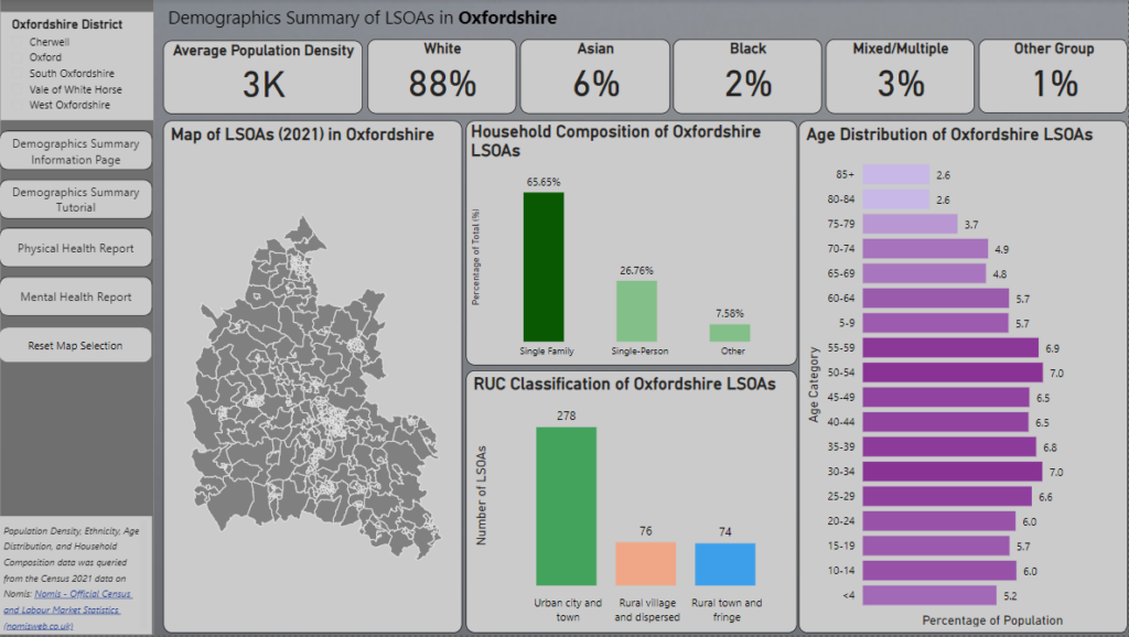
One of the outputs of this project was a Power BI dashboard – an accessible, intuitive, and responsive tool that empowers policy- and decision-makers to identify Oxfordshire areas where food insecurity could aggravate health inequalities.


You can find further detail on the data and methods in the full case study: Does food insecurity lead to greater health inequalities in Oxfordshire?


Using insights to target support

Policymakers in GFO’s network will use the dashboard to help make strategic decisions on where to focus their efforts to best support the food system.  The dashboard enables them to prioritise specific levers (i.e., addressing the most salient food insecurity risk factors) for each area, to improve health outcomes and reduce the prevalence of specific health conditions.

  • Tackling income deprivation in Blackbird Leys and Greater Leys (among the 20% most deprived areas in England) could significantly reduce the prevalence of child obesity (by 0.7% at the reception year and 1.8% at year six) and Type 2 diabetes (by 1.6-1.7%), with each decile shift in the socio-demographic barriers PPFI dimension.

  • Initiatives to make energy more accessible, affordable, and efficient for the population in Barton, Churchill, and Sandhills (whose areas are among the 20% most deprived in England) could significantly reduce child obesity at the reception year (by up to 0.9%) and year six (by up to 1.7%), with each decile shift in the fuel poverty PPFI dimension.

  • The reinforcement of family food support schemes in Churchill, Iffley, Littlemore, and Rosehill (whose areas are among the 20% most deprived in England) is expected to reduce the prevalence of child obesity (by 1.8% at the reception year and 3.6% at year six) and diabetes (to a lesser extent—by 0.3-0.4%).

Further information

Research Team

Ahmad Ammash, Data Scientist, Leeds Institute for Data Analytics, University of Leeds

Dr Francesca Pontin, Senior Research Data Scientist, Consumer Data Research Centre, University of Leeds

Dr Emily Ennis, Research Impact Manager, Consumer Data Research Centre, University of Leeds

Alexander Hambley, Research Software Engineer, Consumer Data Research Centre, University of Leeds

Fiona Steel, Manager, Good Food Oxfordshire

Stuart Newstead, Director, Good Food Oxfordshire

Webinar: Dietary Patterns in UK Consumer Purchase Data

woman scanning item at self checkout - indicating source of consumer data

Poor diet is a leading cause of death in the United Kingdom and around the world.

In this webinar Professor Michelle Morris discusses how methods to collect quality dietary information at scale for population research are time consuming, expensive and biased.

Novel data sources, such as supermarket sales transactions and loyalty card data, offer the potential to overcome these challenges and better understand population dietary patterns.

Michelle shares examples of how these data can be used to better understand population level dietary patterns, how these compare with national recommendations, how they vary by sociodemographic characteristics and what we can do to change them.

Investigating the impact of HFSS Legislation

Blurred image of a supermarket aisle - products not distinguishable but indicating source of consumer data

Since 1 October 2022, new legislation for England restricts the placement of some food and drink products High in Fat, Sugar and Salt (HFSS). 

Products such as confectionery can no longer be placed at store entrances, ends of aisles, or at the checkout in large retail stores and their online equivalents.

The introduction of the legislation prompted the food industry to implement significant changes, including store layout changes by retailers and product reformulation efforts by manufacturers. 

Understanding the impact of HFSS Legislation

Eighteen months on from the legislation’s implementation, a team of researchers led by Professor Michelle Morris, and supported by IGD, will be evaluating the impact of this legislation.

The team are working with ASDA, Morrisons, Sainsbury’s and Tesco, who collectively represent 65%* of supermarket sales, to understand the impact of the HFSS legislation restricting location placement of HFSS products.

The analysis, conducted by researchers at the University of Leeds as part of the DIO Food project, will answer the following research questions:

(1) What happened to HFSS product sales after introduction of the policy?

(2) What happened to the retail product portfolios after introduction of the policy?

(3) Were impacts of the HFSS legislation equitable across different sociodemographic groups across the country?

(4) Has the HFSS legislation led to healthier overall purchasing using Eatwell guide as a metric?

These questions will be answered using store level sales data, supplemented by contextual information collected in interviews and surveys with the retailers and customers.

Read the protocol on Open Science Framework.

Prof Michelle Morris said: “We really are delighted to be working with these four major retailers to evaluate such a significant policy and look forward to sharing findings once available”

Utilising CDRC Products

The sales data provided by the retailers will be for stores selected across deciles of our Priority Places for Food Index (developed in collaboration with Which? in 2022) to allow us to investigate whether the legislation has impacted different communities equally.

The researchers will analyse the impacts of the implementation from a health and sustainability perspective, using the Eatwell Guide.

The team will also use innovative data products created by CDRC’s Dr Fran Pontin (Eatwell algorithm) and Dr Victoria Jenneson (Nutrient Profile Model Calculator) in their analysis, providing insight that cannot be found elsewhere.

Building on previous real-life behaviour change trials

This research is part of a broader UKRI Transforming UK Food Systems academic collaboration, led by Professor Alex Johnstone at the University of Aberdeen, the Diet and Health Inequalities (DIO food) project.

The work package 6 partnership builds upon the University of Leeds ongoing programme of real-life behaviour change trials with IGD to build evidence on what works, and doesn’t, to shift consumers to healthier and more sustainable diets.

Dr Victoria Jenneson said “Applying our CDRC data products at scale will offer a unique perspective on the nuances of the legislation, such as equity. We are excited to uncover impacts on HFSS sales, and on changes to product portfolios too.”

We are looking forward to learning more from this interdisciplinary, cross sector team of Prof Michelle Morris and Dr Victoria Jenneson from the School of Food Science and Nutrition and Dr Alison Fildes and Dr Alice Kininmonth from the School of Psychology at University of Leeds alongside ASDA, Morrisons, Sainsbury’s and Tesco, IGD and wider DIO Food team.

*Kantar Worldpanel Grocery Market Share as of 17/04/24

This research is funded through the Transforming the UK Food System for Healthy People and a Healthy Environment SPF Programme, delivered by UKRI, in partnership with the Global Food Security Programme, BBSRC, ESRC, MRC, NERC, Defra, DHSC, OHID, Innovate UK and FSA. Grant award BB/W018021/1.

Understanding speed behaviours, speed limit compliance, and road characteristics in Leeds

Urban Mobility Image

Understanding speed behaviours, speed limit compliance, and road characteristics in Leeds

Research by Long Chen and Ed Manley uses data provided by Compass IoT to provide an overview of speed behaviours, speed limit compliance and road characteristics in Leeds.

Introduction

Importance of Speed behaviours

Speed behaviours of vehicles are important facets in transport planning, road safety and urban livability. There are also several critical social and environmental aspects linked with speed behaviors, e.g., excessive carbon emissions.

Speed limit compliance

Adherence on posted road speed limits would have positive effects on traffic safety, road capacity, and traffic congestion, etc.

Measures of speed behaviours

Prior studies are often conducted by questionnaire survey; limited sites observation; and simulated driving environment to capture vehicle speeds and driver’s speed behaviours.

Study Data

For this study we used vehicle trajectories with travel speeds and acceleration indicators, provided by Compass IoT. This dataset is available for access on the CDRC data repository. The dataset is available for several UK cities. The data used in this study focuses on Leeds only, and contains 3,008,530 individual point records within 44,321 unique journeys, during October 2023.

The Gaps

• There is an absence of studies capturing speed behaviours and characteristics for large volume of vehicle trajectories on a larger geographical scale.

• There is a lack of knowledge between speed behaviours, road characteristics and urban environment at finer-granularity.

Methods

• Measures of speed selection (including adherence with speed limit) and acceleration behaviours (e.g. slow / rapid) extracted

• Mean measures computed over time (hour, day) and by road segment

• Quantiles used to select boundaries for assessing acceleration and deceleration behaviours, including extreme behaviours (Q1, Q4)

Results

Speed behaviours over time

Temporal variation of speed, acceleration, deceleration in Leeds show that fastest speeds occur during the night-time; Rapid acceleration and deceleration events are more common during the daytime than at night

            Figure 1: Temporal variation of speed by quartiles, Figure 2: Temporal variation of Acceleration, Deceleration by quartiles

Speed selection and adherence over space

Lower speeds observed in. dense road networks and urban areas; Higher speeds observed on highways and major roads.

Figure 3: Average speed at Road segments               Figure 4: Adherence rate at Road segments

Better adherence in dense road networks, and urban areas; Worse adherence on 20mph zones and pedestrianised areas

Acceleration, and Deceleration

Average acceleration, deceleration maps illustrate that higher acceleration and deceleration road segments are located at main roads, particularly around junctions, and suburban residential areas

Roads segments with extreme acceleration, and deceleration behaviours usually accommodate in dense road network, and junctions of road networks.

Conclusion

• Results show distinctive speed limit adherence, acceleration, and deceleration characteristics in road hierarchy and urban areas, highlighting the potential for analysing speed behaviours in urban settings.

• Specifically, lower speed limit adherence behaviours generally occur in roads with lower speed limit, and minor and local roads, in suburban residential areas; Extreme acceleration and deceleration behaviours are found in dense road network, and entries and exits of major roads (e.g. motorways).

• The exploration of speed behaviours opens up new opportunities for considering urban mobility and design, and opportunities for understanding the latent mechanisms and factors influencing these behaviours.

Use the data

Compass Connected Car Vehicle Trajectories and Behaviours data is available via our data service – The dataset, supplied by Compass IoT, is composed of vehicle journeys undertaken in several UK cities during the month of October 2023. 

Was there a Banksy price bubble during COVID-19?

Was there a Banksy price bubble during COVID-19?

A recent study from Dr Stephen Clark explores the change in price of limited-edition Banksy prints over the last decade – we asked him to share his thoughts on whether there was a Banksy price bubble during COVID 19.

Here at the CDRC we work with industry partners to make consumer related data available to trusted researchers, whose work can help us to understand important social challenges. In this piece here we are looking at a particularly niche consumer and their behaviour during an extra-ordinary period in recent history.

The consumers are those who purchased limited edition prints at auction by the street artist Banksy, and the time period is during the global COVID-19 pandemic. In particular, did a pricing bubble occur for his works during this period?

BANKSY | TROLLEYS, non-commercial use https://pestcontroloffice.com/use.asp

Why Banksy?

Banksy is probably the world’s most famous street artist. His true identity is unknown but it is believed that he started his street work during the early 90’s in the English city of Bristol.

BANKSY | STOP AND SEARCH, non-commercial use
https://pestcontroloffice.com/use.asp


He is best known for his satirical humour and takes on modern life, mixing together commercial, political and contemporary images to provide social commentary.

His works consist of one-off originals and, in the late 90’s and early 2000’s, he started to produce a limited number of screen prints in signed and unsigned editions. These were eagerly purchased, initially by an enthusiast class of customer, but, as his popularity and value increased, latterly by an investor class. On the primary market these prints would initially sell for less than £500.

The data – Banksy Auction Results

In this study use is made of the database of Banksy auction results maintained by the www.banksy-value.com web site. This web site has catalogued the details of Banksy works sold at auction houses all over the worlds since the mid 90’s.

The limited edition prints in this database are used to examine what features of a print influence the selling price, and to what extent these prices may have been affected by the COVID-19 pandemic

The impact of COVID-19 on the sales prices of Banksy limited edition art works

The www.banksy-value.com web site maintains a tracker index for the sales prices of Banksy limited edition art works and this begins to show the impact and the extent of COVID-19 on his market.

From this chart it is clear that there was a steep rise in the sales price of Banksy prints starting in early to mid-2020, and that in recent months the prices have dropped considerably to back where they were at the start of the pandemic.

But does this meet a definition of a bubble? A bubble in asset classes, such as stocks and shares, housing, crypto-currencies and even tulips, is composed of many stages: Expectation; Boom; Euphoria; Profit-taking and Panic.

The start of the COVID-19 pandemic was an unprecedented time in recent history. Many people were unsure of their futures, both health wise and economically.

This uncertainty could have gone two ways in the Banksy art market, either people would be desperate to sell his works to get cash for daily expenses and his prices would crash, or they could seek out opportunities to invest for the future and look to Banksy works to provide a safe – and accruing – haven for any savings or credit. Clearly from this figure it was the latter case.

In the hedonic regression model for Banksy prints, a number of factors were controlled for before examining the impact of COVID-19. These included the particular image, if the print was signed by Banksy, the condition of the print, and the size of the edition. The reputation of the auction house and the location of the sale were also used along with a linear time trend. To capture the impact of COVID-19 a series of eight half year 0/1 variables were used to measure this impact and by using a random effects model, the impact was allowed to vary by the image. This would allow an assessment of whether the price of some images were impacted by COVID-19 more than others.

Banksy | Game Changer, non-commercial use https://pestcontroloffice.com/use.asp

Firstly the extent of the COVID-19 shock is shown in this chart. In the years prior to the second half of 2019, the long run cost of a Banksy print at auction was about £10k, but by the end of 2019 the price was more in the region of £25k. These prices quickly rose, by the end of 2020 tripping to around £75k within a year. Such prices were not sustained however, and starting in the second half of 2021 the prices began to fall.

Some prints were affected more than others. The iconic ‘Flower Thrower’ (aka ‘Love is in the Air’) print nearly quadrupled in price at the peak of the bubble, whilst some more mainstream prints showed a more modest doubling in prices.

Banksy joins Warhol and Hirst with the dubious honour of having his own bubble.

It is the contention of the article that accompanies this piece that there was a bubble in the price of Banksy prints sold at auction during the COVID-19 pandemic and that the size of the bubble inflated prices to around 3 time their pre-pandemic levels. Prices had by early 2023 returned to the levels seen before the pandemic. The size of the bubble also varied by the print image.

Banksy has now joined other artists such as Warhol and Hirst with the dubious honour of having his own bubble, and he has lost his mystic that his works would always hold their value.

Clark, S. Evaluating the impact of the global COVID-19 pandemic on Banksy’s limited edition print market. SN Bus Econ 4, 40 (2024). https://doi.org/10.1007/s43546-024-00638-1

BANKSY |LOVE IS IN THE AIR (FLOWER THROWER), non-commercial use https://pestcontroloffice.com/use.asp
BANKSY | SALE ENDS (V.2), non-commercial use https://pestcontroloffice.com/use.asp

How do we lower the barriers to understanding sustainable diets?

Plate of healthy food including grains, fish, green beans and tomatoes

How do we lower the barriers to understanding sustainable diets?

It is well publicised that a societal shift towards a more sustainable diet would help to limit global warming, but how easy is it for individuals to understand what a more sustainable diet might look like in practice?

The Paris Agreement (UNFCCC, 2015) sets long term goals to guide all nations to substantially reduce global greenhouse gas emissions and to pursue efforts to limit global temperature increase to 1.5°C above pre-industrial levels, recognizing that this would significantly reduce the risks and impacts of climate change.

Recent research from CDRC’s Dr Susan Lee and colleagues from the Centre for Climate Change and Social Transformations, published in Frontiers in Sustainable Food Systems, explores how we can use complex data from Integrated Assessment Models (IAMs) to identify dietary shifts that align with these goals, then simplify through visualisation to help people make informed choices about possible lifestyle adjustments.

What is an Integrated Assessment Model?

An Integrated Assessment Model (IAM), such as the IMAGE IAM used in this study, is a model that simulates interactions between climate, economy, society and the biosphere to evaluate climate change impacts and develop mitigation policies.

Traditional IAM outputs are incredibly useful to help us understand the impact of dietary shifts, but the complexity of the data and the need for detailed analysis can make them largely inaccessible beyond the research community.  

Shows complex flow chart indicating that IAM outputs require expert analysis
Source: PBL 2014

This research explores how visualisation can be used to make these insights more accessible to both diet, nutrition, and sustainability professionals and the wider public.   

Translating IAM outputs into accessible visualisations

The researchers systematically examined the impact of modelled changes in food demand on regional diets and dish visualisation. 

Their approach involved preparing and interpreting IAM scenario data, establishing food consumption baselines for Sweden, China the UK and Brazil and applying the Diets, Dishes, Dish Ingredients (DDDI) framework* to analyse shifts in food consumption patterns.

Shows methodology of Integrated Assessment Model (IAM) data processing and translating for the regional diets and dish visualisations.

Methodology schematic representing the stages of Integrated Assessment Model (IAM) data processing and translating for the regional diets and dish visualisations.

Visualising current and potential dishes

They then worked with a designer to create proportional visual representations of current dishes and potential dishes for 2050 to highlight and better communicate the balance of plant and meat-based foods in potential future diets.

Sweden

Current dish: (Köttbullar) include meatballs comprising of beef and pork which are served with gravy, mashed potatoes, lingonberries, and green beans (A)

Future dish: Meat replaced by lentils, nuts, and seeds, while the proportion of vegetables expands to occupy half the dish by 2050 (B)

China

Current dish: Sweet and Sour Pork dish includes pork with pineapple, red and green peppers, and onions together with rice. (C)

Future dish: The pork is replaced by tofu (soy curd) (D)

UK

Current dish: Chicken Korma consists of chicken, vegetables (onion, tomatoes, and a sprinkling of coriander) with rice (E)

Future dish: Chicken gradually replaced by pulses (chickpeas and lentils) with the introduction of broccoli to represent the increased vegetable proportion between 2020 and 2050 (F)

Brazil

Current dish: Feijoada – the dish consists of pork, beef, and beans, and is accompanied by a slice of orange, salsa, pan-fried collard beans (leafy vegetable) with garlic, and rice (G)

Future dish: The 2050’s dish includes sweet potato (considered a staple like rice) and black-eyed peas (pulses) (H).


Overcoming barriers through better communication

Whilst there is still more work to be done in this area, this study represents an effort to make complex dietary transition data more accessible.

Visualisations, like the ones shown above, could be used by diet, nutrition, and sustainability professionals to aid discussions around dietary changes with different communities.  

Dr Susan Lee explains ‘We know that the shift in people’s diets will face barriers such as increased food costs, changes in habits and preferences, accessibility of plant-based foods and potential cultural and social barriers that may hinder the shift in diets to tackle climate change. However, the use of visual communication frameworks showcased in this research could help ease the transition to more sustainable diets within communities.’

Read the full publication: From future diets to dishes: communicating dietary shift associated with a 1.5°C scenario for Brazil, China, Sweden and the United Kingdom

*de Boer, J. and H. Aiking, Strategies towards healthy and sustainable protein consumption: A transition framework at the levels of diets, dishes, and dish ingredients. Food Quality and Preference, 2019. 73: p. 171-181.