Home » News

Serendipity in a career in understanding foodborne illness with spatial data

Rachel Oldroyd@r_oldroydUK Data Service Data Impact Fellow and Quantitative Human Geographer at the University of Leeds, shares her journey into the world of geographical data and developing a career in understanding foodborne illness with spatial data.

“So, what do you do?”

Albert Einstein once said “If you can’t explain something simply, you don’t understand it well enough” but I have to admit, I often struggle when asked this question. Mainly because my area of work is so inter-disciplinary (a combination of geography, social science, statistics and computing) and also because it isn’t a well-known discipline (I’m always envious of my husband who doesn’t have to explain what a Secondary School Teacher does). So, torn between giving a full blown explanation of my whole PhD project and an overview of the world of Geographical Information Science (GIS), which I teach part-time at the University of Leeds, my usual answer is “I work with spatial data”. This is tactful, because it gives the person an out if they don’t want to commit to a conversation they may consider boring for the next five minutes and instead we can move onto talking about the weather or the cute puppy that just walked past.

For genuinely interested parties I would explain that my research entails using restaurant review data to identify and map outbreaks of foodborne illness (as opposed to traditional GP data which is associated with a myriad of problems) but that I’m also exploring the spatial patterns of populations at risk (where do vulnerable people live). I may also explain that a GIS is a type of software used to “analyse and map data to make inferences about the physical world and the people living in it” and that it’s an invaluable tool for my research and across many other fields.

So let’s consider populations at risk. Tobler’s first law of Geography tells us “everything is related to everything else, but near things are more related than distant things” so it makes sense that geographical areas can be grouped together based on the socio-economic characteristics of the people living within them. These characteristics might relate to deprivation, ethnicity or age for example. In 2006, Dan Vickers devised a well-known classification grouping together output areas, but many other classifications exist based on the same principles. Classifications are used extensively in geospatial research and beyond; from resource allocation and retail planning to crime prevention.

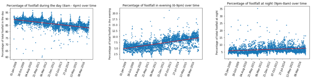
In the context of foodborne illness; elderly people, pregnant women, young children and immune-compromised individuals are not only more likely to contract foodborne illness but they are also more likely to suffer severe side effects due to their weakened immune systems so identifying where they are likely to live is important from a policy perspective. But vulnerable individuals are not the only ‘at risk’ populations. Healthy persons may also be at risk based on their physical environment and behaviour. Populations who frequently eat fast food and live within close proximity of unhygienic food establishments maybe at higher risk of contracting foodborne illness than those who do not eat takeaways regularly. Similarly, healthy people who undertake unhygienic food practices are more as risk then those who abide by food hygiene recommendations.

According to research by the University of Cambridge, Blackburn has the highest number of takeaways per resident than any other borough in England, in fact it has a staggering 236 takeaways (2.6 for each of the 625 people living within its central borough)*. Offering extremely cheap prices in one of the most deprived areas in the UK, it is no surprise that Blackburn’s takeaways have become a staple part of the local residents’ diet, putting them at greater risk of contracting foodborne illness. With so many takeaways in business, the likelihood of residents living near (and eating at) one with a low hygiene score increases and it also becomes difficult for the local food safety teams to undertake inspections.

“How did you end up doing that?”

Again, this isn’t a particularly easy question to answer, but it’s something which I often consider. My journey into the world of geographical data was certainly the result of a series of circumstantial events. I didn’t ever have a burning desire to work in a quantitative field, but as my favourite subject at school was Geography and I was good at Maths, a career working with spatial data is actually quite logical. The proliferation of data over the past few years has led to a rise in GIS and geospatial  jobs, the number of which is projected to rise by 30% by 2020 (ESRI, 2017). Thinking back, as a teenager I actually wanted to be a secondary school teacher as I thought that this was the only Geography related career there was (how wrong I was!), so without any other real plan I applied for and accepted a place studying a Geography and Education degree at University.

Not getting the A-Level grades I needed for this course was actually one of the best things that could have happened at this point (or I may have actually become a Geography Teacher!). I was forced to look at alternative options for Higher Education and I was offered a place on the BSc in Geographical Information Science programme at Newcastle University. This is where my spatial-data journey began. Covering all aspects of Geographical Information Science from collecting, processing and visualising data through to coding bespoke tools and applications, this degree was completely different to anything I had done previously and I became fascinated with the world of data. And the rest, as they say, is history. Upon graduation I continued onto an MSc in Computing Science to further develop my programming and analytical skills and then held a position as an outreach officer for a short period of time, raising awareness of the importance of quantitative skills and GIS in schools.

From accepting a job at the University of Leeds four years ago to starting my part-time PhD in September 2015, I’ve found that quantitative and programming skills are essential for my everyday work, from analysing large survey datasets in R to using GIS to map census data. I would encourage anyone interested in working with data or entering the world of research to learn basic programming skills and statistical analysis.

*https://www.theguardian.com/inequality/the-northerner/2017/jul/28/chips-burger-for-quid-welcome-to-takeaway-capital-of-england-blackburn

Feature image: Darwen Street, Blackburn – © Copyright Robert Wade and licensed for reuse under the Creative Commons Licence.

Article originally published on blog.ukdataservice.ac.uk as part of their Data Impact Fellows 2017 programme.

Video now available – Dr James Cheshire speaking at the Data Science Festival in May 2017

Here is the video of Dr James Cheshire’s seminar at this years Data Science Festival.

This talk showcased how large and complex datasets can be visualised in compelling and informative ways. Drawing from a range of examples that cover everything from commuter flows to baboons, cyclists to songbirds in order to demonstrate how maps and data visualisations offer a window into big data. Many of the selected examples started out life in R so it’s a chance to see how R is not just great for data wrangling but visualisation as well.

Classification of Westminster Parliamentary constituencies using e-petition data

In a representative democracy it is important that politicians have knowledge of the desires, aspirations and concerns of their constituents. Opportunities to gauge these opinions are however limited and, in the era of novel data, thoughts turn to what alternative, secondary, data sources may be available to keep politicians informed about local concerns. One such source of data are signatories to electronic petitions (e-petitions). Such e-petitions have risen greatly in popularity over the past decade and allow members of the public to initiate and sign an e petition online, with popular e-petitions resulting in media attention, a response from the government or ultimately a debate in parliament. These data are thus novel in their availability and have not yet been widely used for research purposes. In this article we will use the e-petition data to show how semantic classes of Westminster Parliamentary constituencies, fitted as Gaussian finite mixture models via EM algorithm, can be used to typify constituencies. We identify four classes: Domestic Liberals; International Liberals; Nostalgic Brits and Rural Concerns, and illustrate how they map onto electoral results. The findings and the utility of this approach to incorporate new e-petitions and adapt to changes in electoral geography are discussed.

Read the full paper online in EPJ Data Science

Predictive Data Analytics for Urban Footfall

Molly Asher (Leeds Institute for Data Analytics), Simon Brereton (Leeds City Council), and me have recently finished a project whose aim was to analyse footfall in Leeds city centre and build computer models (using machine-learning) that could estimate footfall given some external conditions (e.g. the weather, time of year, whether it was a holiday, etc.). We would like to use a model like this to help the Council with questions like:

  • If it is going to rain next Tuesday, how busy will the city be?
  • Last Wednesday we organised x, how successful was our event, taking into account that it was cold and rainy?

We’ve yet to compile the final report, but if you’d like any more information about the project (including the data we used and the code that Molly wrote), you can find more details on the main github page. This post will briefly summarise some of the more interesting findings.

Initial Data Analysis

The first stage was to find and analyse the required input data. We brought together:

  • Footfall camera data: hourly counts of footfall from a number of locations, published by the Data Mill North
  • Weather data: daily temperature, wind, and rainfall, data published by the School of Earth and Environment at the University of Leeds
  • Dates for school, university, and public holidays in Leeds

In the future we could find other data sets that might represent factors that influence footfall, such as car parking availability, train prices, etc., but for now we just used the weather and holiday data.

One of the most interesting findings from the first stage in the data analysis was that the times that people use the city centre seem to have changed over the years. For example, the figure below shows how the proportion of people visiting the centre during the day, in the evening, and at night, has changed from 2009. After the opening of the Trinity Shopping Centre in March 2013 there has been a substantial increase in the proportion of people coming to the city centre in the evenings. Shops in the Trinity Centre don’t close before 8pm, which is later than the time that shops in the area traditionally closed, so it seems as if this has encouraged later attendance. Other shops in the area have probably started to stay open later into the evening as well.

Modelling Footfall with Machine Learning

The main aim of the work was to create a model that could predict levels of footfall given some external conditions. We tested a large number of models using the Scikit Learn python library to see which was the best, and in the end a Random Forest model performed the most strongly. Again, for full details about the methodology, data (training, test, validation, etc.) and the code, see our github page.

Model Accuracy
The right figure shows how well the model actually made its predictions. On the whole it behaved reasonably well. Although on some days the predictions were very poor (±20%) the majority are in the range of (±10%).
Feature Importance
A benefit with random forest models, over some other machine learning techniques, is that it is possible to extract information about the input parameters (‘features’) that are the most important. This doesn’t tell us whether they are linked with more or less footfall, but does tell us which are the most useful for predicting footfall. The list below shows the top 10. It is important to note that this list is not definitive as there are a number of factors that can affect the importance and if we had chosen another model we would have found slightly different results, but on the whole the variables below were fairly consistent across all of the models tested. The weather variables appear to be the most important, which isn’t especially surprising, but is still interesting.
VariableRelative Importance
Mean daily temperature1142
Mean daily rainfall383
Monday131
2013131
Saturday130
2016130
After Trinity opened123
Thursday122
Tuesday116
School holiday115

Analysing Events
The most useful application of the model is its use as a tool to evaluate how successful previous events in the city were, after taking account of external conditions (day of the week, weather, whether it was a holiday, etc.). For example:

  • For the Tour de France Grand Depart on 5th July 2014, there was 37% more footfall in the city centre than we would have expected otherwise
  • The Christmas light switch-on (10th Nov 2011) attracted 22% more people than we would have expected).
  • The opening of the Trinity centre on 21st March 2013 attracted 33% more footfall.

At the other end of the scale, the model can also help to explain why some days have very low footfall. This occurs during snow, for example, or where other events such as Leeds Festival actually appear to draw people away from the city

The model discussed here is in early stages, and still needs some work to make it more rigorous, but it is clearly a useful tool and one that could provide valuable insight into the drivers of footfall into city centres.

Tackling Food Waste with Asda

It is estimated that one-third of edible food produced for human consumption is lost or wasted globally each year. In the UK, food waste derived from households accounts for 7.3 million tonnes of total food and drink wasted annually. UK households throw away approximately a third of the food they purchase for consumption. In a bid to tackle this problem, CDRC Co-investigator Professor William Young and his team at the University of Leeds joined with Asda to implement a multichannel initiative aimed at changing customer attitudes and behaviour.

The research team used six national communication channels at Asda (in-store magazine, e-newsletter, Asda’s Facebook site, product stickers and in-store demonstrations), to send out standard food waste reduction messages (taken from the WRAP Love Food Hate Waste campaign) during two 4-6 week interventions periods, one in 2014 and the other in 2015. Six national surveys over 21 months tracked customers’ self-reported food waste. Customers answered the online questionnaire a few months before, two weeks and a few months after the each intervention period. Participants were recruited from Asda’s existing customers that had signed up to complete market research panel of 30,000 customers.

How was food waste measured?

The degree to which consumers had engaged in food waste behaviours was measured using two items, frequency and quantity.  Frequency of waste was measured by asking consumers “How regularly do you think good is thrown away in your household?”  Responses were given on a five-point Likert scale (1 = Never, 5 = Most mealtimes).

The quantity of foods wasted was measured by asking “Over the past week have you thrown out any of the following items? Please select all that apply.” Participants indicated the types of foods wasted from nine product categories including: fruit, vegetables, salad, bakery, dairy, meat and poultry etc.  After each survey the costs of food waste were calculated by coding each product type using WRAPs cost of food waste.

The difference between the figure calculated from the survey conducted before the intervention and the one conducted after the intervention was then calculated to give food waste savings.  Once the food waste analysis was complete, the results from the sample population were upscaled and applied to the total customer base.

Food waste behaviour change:

  1. Three interventions were implemented in 2015, when surveyed 81% of those who recalled the interventions said they planned to follow the advice provided.
  2. An estimated two million customers are making changes in their homes as a result of the campaign. Examples include using shopping lists to shop smarter, planning meals and using up food that would be otherwise thrown away.
  3. Customers saved on average £57 per annum by applying these changes in their home.

Asda’s Chief Customer Officer, Andy Murray, said: ‘As a major food retailer, we have a responsibility and the ability to bring about large scale change when it comes to tackling food waste. By partnering with the University of Leeds, the team has been able to take our insight and really explore this area, meaning that we now have a greater understanding of customer attitudes and behaviour, helping shape the way we communicate with our customers and ultimately how we do business.’

University of Leeds Professor, William Young, said: Working with a large scale retailer like Asda, and its millions of customers, has been an invaluable experience. Not only have we come away with real, measurable insight from shoppers but we’ve also seen the direct correlation between our recommended actions and tangible behavioural change. While our formal partnership is coming to a close, the legacy of this project will certainly live on in the benefits passed to customers and of course the environment.”


Related Papers

Social media is not the ‘silver bullet’ to reducing household food waste, a response to Grainger and Stewart (2017) – C. William Young, Sally V Russell, Ralf Barkemeyer

Bringing habits and emotions into food waste behaviour – Sally V. Russell, C. William Young, Kerrie L. Unsworth, Cheryl Robinson

Can social media be a tool for reducing consumers’ food waste? A behaviour change experiment by a UK retailer –  C. William Young, Sally V Russell, Cheryl A. Robinson, Ralf Barkemeyer


Research Team

This research was commissioned by Innovate UK (Knowledge Transfer Partnership Scheme) and Asda-Walmart.

The research team:

Professor William Young, Sustainability Research Institute/Consumer Data Research Centre

Dr Sally Russell, Sustainability Research Institute

Dr Phani Kumar Chintakayala, Consumer Data Research Centre

Dr Ralf Barkemeyer, Kedge Business School, France

Cheryl Robinson and Laura Babbs, KTP Associates Asda-Walmart

CDRC’s Senior Researcher Ollie O’Briens work features in the Evening Standard and City AM newspapers

CDRC’s Senior Research Associate Oliver O’Briens work on Broadband speeds throughout London has featured in the Evening Standard and City AM newspapers.

The article featured on 5th July in the Evening Standard paper on pages 12 and 14.

The Evening Standard web link is: http://www.standard.co.uk/news/techandgadgets/revealed-londons-fastest-areas-for-broadband-suburbs-have-superfast-internet-while-packed-urban-a3580021.html

City AM have published an article: http://www.cityam.com/267884/mapped-londons-best-and-worst-broadband-areas-city-workers


Household Mobility – Where and how far do we move?


In the first article in this series I discussed why it is important for us to understand household mobility, outlined the sources currently available to researchers and highlighted the potential of using commercial data as a possible alternative to census or admin data.

Using large scale commercial data sets, such as the Whenfresh/Zoopla Property Transactions and Associated Migration (available via the CDRC), is exciting as it can answer questions and enrich our understanding of mobility patterns and population change in the UK.

The Consumer Data Research Centre has partnered with online property search provider Zoopla and data insight consultancy Whenfresh to obtain data about the characteristics of properties which have been sold in England and Wales. For the 2014 calendar year, visualised here, there were over 900k unique property transactions. 

Where do we move?

This image highlights some larger UK cities and the flow of households between them. When a line becomes more opaque on one side it means that the flow of house movers is directed towards the respective city by a majority of people.

1. Over 68% of moves occurred within the same postcode area (e.g. the postcode area starting LS covers Leeds, EX covers Exeter, etc.) and 34% of moves occurred within the same postcode district (e.g. LS1 covers much of Leeds city centre).
2. Largest number of moves within the city:

  • London – 6057
  • Bristol – 2523
  • Nottingham – 1938
  • Leeds – 1427
  • Sheffield – 1387
  • Manchester – 1342

3. London accounts for 7.1% of all moves in England and Wales (either in to, out of or within the city) and is very well connected to the greater South East region, towns on the south coast and other key cities. London and the greater South East has been termed an ‘Escalator Region[1]’, whereby young people move in to gain skills and training before eventually moving on.

How far do we move?


  1. On the whole, households don’t tend to move very far, the overall median distance of a move in England and Wales is 3.2 miles (we use median distance as opposed to average distances as there are a small number of moves across very large distances which skew the reporting)
  2. People who move within the East of England move further than anywhere else (2.8 miles) whereas the median distance of moves in London is only 1.6 miles. These values are not surprising, given the settlement patterns in the East of England are very different to those in London: the move from Cambridge to Norwich is 64 miles, compared with just 30 miles between Hayes in the far east of London to Dartford in the far west of London.
  3. People moving within the regions of the north of England travel shorter distances than those in the south. The median distance of move within the North East is 1.61 miles, within the North West is 1.73 and within Yorkshire and Humber is 2.01 miles. This is compared to 2.42 miles in the South East and 2.3 miles in the South West.


How connected are our cities?

City Received households from % of places in England and Wales Sent households to % of places in England and Wales More households moving into or out of city?
London 39% 60% Out (-4157)
Bristol 23% 28% Out (-376)
Norwich 20% 15% In (+148)
Nottingham 18% 22% Out (-265)
York 17% 14% In (+81)
Leeds 15% 16% Out (-238)
Swindon 15% 12% In (24)
Manchester 15% 18% Out (-396)
Birmingham 15% 21% Out (-560)
Southampton 15% 19% Out (-169)
Reading 14% 25% Out (-288)


Norwich appears to be an attractive destination with 20% connectedness and a net gain of 148 households. Nottingham, York, Leeds, Manchester, Birmingham and Southampton are all well connected cities, appearing in the top ten. One surprisingly well connected city for inflows was Swindon, which received households from 172 other places. The surprising entry in terms of outflow connectivity is Reading, which was connected to 25% of other places.

What data are used in these visualisations?

The Consumer Data Research Centre has partnered with online property search provider Zoopla and data insight consultancy Whenfresh to obtain data about the characteristics of properties which have been sold in England and Wales. For the 2014 calendar year, visualised here, there were over 900k unique property transactions. Attached to these transactions data are the Royal Mail redirection service data which provides details about the forwarding postcode for over 212k households who moved. Those records for which there is a forwarding address (and as such an origin-destination link) represent 19% of the 1.1m residential property sales made in 2014[2].  There are a number of unique advantages to using these data:

  • They are timely and easy to update. The data presented are for the calendar year 2014 but other date ranges could be specified.
  • They provide good temporal coverage. Instead of a yearly snapshot of transitions they report the exact date that a property was sold. This allows us to start to understand seasonal trends in mobility.
  • The geography provided is extremely detailed. Sales (origins) are at address level while destinations are delivered as postcodes. This allows us to start to assess mobility patterns at a very small scale, answering questions about communities rather than the more common administrative units used in previous work.

Consumer data like those used here have a role to play in the future of understanding mobility patterns, and population change more generally.

The visualisations were created by Herwig Scherabon[3], an expert in data visualization and information design. Interpreting and visualising flow information is particularly difficult because of the dimensions of the data. Having origins and destinations dictates a need for some way of linking the two together, and the volume of data soon becomes unmanageable. This is why design decisions, like being selective in the number of data entries shown or deciding how opaque crossing lines should be, is important when trying to get a message across.

Next blog

This article focusses on the connectedness of towns, cities and villages in England and Wales as well as the distances households travel when they move home. What we haven’t done is start to look at who those households are, what kinds of moves they are making and why. That will be the focus of the next article, an assessment of the geodemographic profiles of households who are moving within England and Wales.

About the author

Dr Nik Lomax is a University Academic Fellow at the University of Leeds, his research focuses on the way in which demographic behaviour changes over time and how people interact with the areas in which they live and work. Much of his work focuses on the dynamic processes involved in migration but he is also interested in the social implications of changing demographic composition: household formation, social exclusion and population ageing for example. Areas are shaped by changing economic conditions, policy interventions and social attitudes, which in turn has an impact on demographic behaviour. Modelling and explaining these complex interaction is key to the work the work which he does.

[1] Reference to Tony Fielding’s work here

[2] HMRC data

[3] http://scherabon.com/

Leeds Data Science Society wins Hiscox University Challenge

Congratulations to the Leeds Data Science Society who have been announced the winners of the Hiscox University Challenge. The University of Leeds team fought off stiff competition from York and LSE to secure the trophy and a prize of £1000 for their society.

All of the teams were set two challenges – the first was to model the causes of railroad accidents in the US and identify the factors that may increase liability and the second was to consider what the factors of success look like for a start-up company in the UK. It was their work on the second challenge that swung it for Leeds.

Steven Wilkins, Group Head of Underwriting Insight, paid tribute to their sophisticated analysis as well as their energy and enthusiasm throughout the year:

“All of the teams produced some excellent work and we really enjoyed working with them to solve the challenges. But it’s congratulations to the University of Leeds team on this occasion for their smart analysis of the data and for their infectious enthusiasm throughout the entire project.

“Data can be used to complement the expert knowledge we have within Hiscox. If we can use it to make even smarter decisions more often, then we’re winning.”

Lawrence Ning Lu, CDRC PhD student and the Leeds team captain, praised his team for their hard work and dedication and said:

“It’s amazing to win the Hiscox University Challenge. Many people consider data science to be about how many new blackbox techniques we can perform, but we see it as how much we could add value or new insights to a business. We were able to demonstrate this to Hiscox and win the cup.”

Professor Mark Birkin, Director of Leeds Institute for Data Analytics, University of Leeds commented:

“It has been our pleasure to host and support a flourishing multi-disciplinary Data Science Society at Leeds, and take great pride and encouragement from their success in this national competition. We applaud Hiscox for their initiative in promoting awareness of data science through such a creative initiative, and would encourage other similar businesses to explore novel ways to stimulate capacity in this strategically vital technology.”

Professor Timothy M. Devinney, University Leadership Chair and Professor of International Business, Pro Dean of Research & Innovation at Leeds University Business School, University of Leeds said:

“As its title suggests, the university challenge is a fine example of modern business embracing new ideas with the goal of overcoming current challenges and preparing for those that might arise in the future. It’s exciting to see a group of talented students who are able to apply new techniques and fresh insights to those challenges. For the university, this achievement will provide a template for the ways in which we, as a business school, can develop a closer collaboration with industries and encourage more interdisciplinary research.”  


Holborn identified as unhealthiest place in Great Britain according to new study

A new study by University of Liverpool researchers has identified Holborn in London as the unhealthiest place to live in Great Britain.

Using a new data resource tool which contains a range of lifestyle and environmental measures, researchers were able to identify neighbourhoods that are healthy and those that are unhealthy.

The results can be seen on an interactive map at: https://maps.cdrc.ac.uk/#/indicators/ahah/  and the data can be downloaded for individual local authorities at:  https://data.cdrc.ac.uk/product/cdrc-ahah-index and nationally at:  https://data.cdrc.ac.uk/dataset/access-to-healthy-assets-and-hazards-ahah

The type of information which the data tool used related to levels of air pollution and access to various amenities such as fast food outlets, health services including GPs, pubs, and off-licenses.

The study found that within Holborn the neighbourhood surrounding Hatton Garden and Farringdon Station had the greatest access to unhealthy opportunities such as fast food or alcohol, combined with high levels of air pollution.

At a national level, the study found that all other neighbourhoods in the top ten were located within Inner London.

By contrast, the healthiest place to live was ‘Great Torrington’ in North Devon. The small market town has low levels of pollution, good access to parks and green space, few retail outlets that may encourage poor health-related behaviours, and good access to health services.  Eight of the top ten places to live where located in Scotland.

Liverpool Lecturer in Health Geography, Dr Mark Green, who undertook the study, said:

“This study used a new data tool which has been developed in conjunction with the Consumer Data Research Centre which allowed us to pull together freely available information from sources such as GP surgeries, Health Centres, fast food outlets, air pollution statistics published by the Environment Agency.  Whilst the information has been available, it has not been collated all together.

“The statistics reveal important insights about the concentration of certain amenities that may be damaging or promote health. For example, on average, individuals in Great Britain are roughly 1 and half minutes (driving time) – or 1.41km – from a fast food outlet or 1.35km from a gambling outlet and roughly 1 minute 10 seconds – 1.14km from a pub.”

“We also found that 24% of postcodes in Great Britain were located less than 1 km of a fast food outlet and 52% within 5 km. These statistics reveal troubling issues with the neighbourhoods we live in and how they may be damaging to our health.”

Professor Alex Singleton, Deputy Director of the Consumer Data Research Centre, said: “Our study found that access was not evenly spread across Great Britain – rural areas have poorer access to many of these services, and those services which are seen as damaging to health are concentrated in poorer areas.

For example, people who live in the least deprived 10% of neighbourhoods are just over two and a half times further away from a fast food outlet than people who live in the most deprived 10% of areas.”

The data resource is available online (https://maps.cdrc.ac.uk/#/indicators/ahah/) and free for anyone – from policy makers to members of the public –  to explore how near or far away they are to services, and how this varies across their local (and national) regions.  Users can log on and can either click on the map or search with a postcode.

Dr Mark Green added: “We anticipate that this resource will be an important tool for citizens and policy makers alike interested in how their neighbourhoods may be associated to their health.”

The data resource is part of the Consumer Data Research Centre (CDRC) which aims to unlock valuable insight from the vast amounts of data collected by business, local and national government organisations.

For further information, please see this blog post from Dr Mark Green:

https://geographicdatascience.com/2017/06/29/unhealthiest-place-gb/

CDRC launches ESRC Innovation Fund

The Consumer Data Research Centre is pleased to invite proposals from UK-based academics for projects that will capitalise on our core consumer data sets, extend our network of partners, and drive forward substantive and innovative social science research across a broad range of disciplines and research areas.

We welcome proposals that would contribute to our existing CDRC research themes, as well as extensions into other research areas of strategic significance, including those aligned with the ESRC’s priorities in:

  • Mental Health
  • Housing
  • Productivity
  • Understanding the Macro-Economy
  • Ways of Being in a Digital Age

The Centre is looking to fund in the region of 8-10 projects, each valued at between £20,000-60,000 (100% fEC).  Projects will run from early October 2017 and must be completed no later than the end of September 2018.

Further information is available at: https://www.cdrc.ac.uk/research/innovation_fund/