Home » Uncategorised » Page 7

My Perspective on Hybrid Working: The New Normal?

My Perspective on Hybrid Working: The New Normal?

Hi, I’m Simon, one of the LIDA Data Scientist Interns, in the unique position of splitting my working week between home working and working in one of LIDA’s Safe Rooms (for use when analysing controlled data in secure conditions without internet access). This is because I am currently working on a project with the Office for National Statistics (ONS), funded by Administrative Data Research UK (ADR UK) – The Local Data Spaces Pilot.

The Local Data Spaces Pilot project aims to develop novel insight for Local Authorities in response to the COVID-19 pandemic, providing up-to-date, high-quality analysis at granular levels.  Principally, we will use health data from the Test and Trace programme, non-health data provisioned by the ONS and the Joint Biosecurity Centre (JBC) and Local Authority ingested data to create novel and innovative insights in support of individual Local Authority policy needs. We aim for this work to inform impact monitoring, allocation of resources and a better understanding of the pandemic at local levels. 

Simon Leech


Simon is an Intern at Leeds Institute for Data Analytics, working with the CDRC team to apply data science solutions to solve complex, real-world challenges.

In this article I’m going to share some initial thoughts and feelings on how I’ve found building new working relationships remotely through the Programme, the ways in which my weekly routine has taken shape and the pros and cons of hybrid working.

At the beginning of this project I felt very overwhelmed at the thought of a newly-appointed Data Scientist Intern being thrown in at the deep end with expert colleagues, so I can only thank the rest of my team for their help and support throughout! The ADR UK Support Team is made up of three other academic researchers, among them Post-Doctoral Researchers and Lecturers. The wider support team spans Research Analysts, Directors and high-level leadership colleagues from the ONS and ADR UK. Across the four stakeholders, we have varying engagement.

Typically, the ADR UK Support Team will communicate almost daily, discussing the particular deliverables and current progress. We meet with the JBC, ADR UK and ONS on a fortnightly basis to provide a high-level overview. Insights from these fortnightly meetings are then disseminated to a wider group of stakeholders, and serve as a touch-point for mitigating risks- as it is important to remember this is a pilot study, so there is opportunity to learn what works best!

This project is inherently collaborative; we are working with and for Local Authorities, to provide them with the datasets, code and outputs related to the COVID-19 pandemic. By learning the skills, ways of work, and personalities of the other team members, I believe we have built a strong team dynamic, and one that fosters collaboration, innovation and insight, across the four actors involved.   

I began this LIDA Data Scientist Internship having never had a full-time post, and I still have the bizarre knowledge that my colleagues of nearly 5 months are people I am yet to meet in the flesh.”

However, I really feel I know them well, and feel we all made a concerted effort to gel together.  The Data Scientist Interns have a scheduled Friday evening after work social call, for us to chat and wind down after the week, and also scheduled Coffee Breaks in our calendars: a 30-minute break 3 times a week to get away from our work and simply chat to others in a similar position.

Whether this might be an informal discussion on the project itself, asking for help, or what everyone did at the weekend, these Coffee Breaks ensure we don’t feel isolated while working from home alone, foster friendships and work-place groups and enable us to provide help and support to others. Personally, I have been made aware of the Open Data Institute Conference and various training courses, events and online webinars through fellow Data Scientist Interns, and have sought their help with coding issues, and data visualisation techniques in R. The wealth of knowledge across the Data Scientist Interns is fantastic, and by ensuring we all have strong relationships, we know who to talk to for support on a particular issue, ensuring the collaborative aspect of the Data Scientist Internship Programme, even remotely!

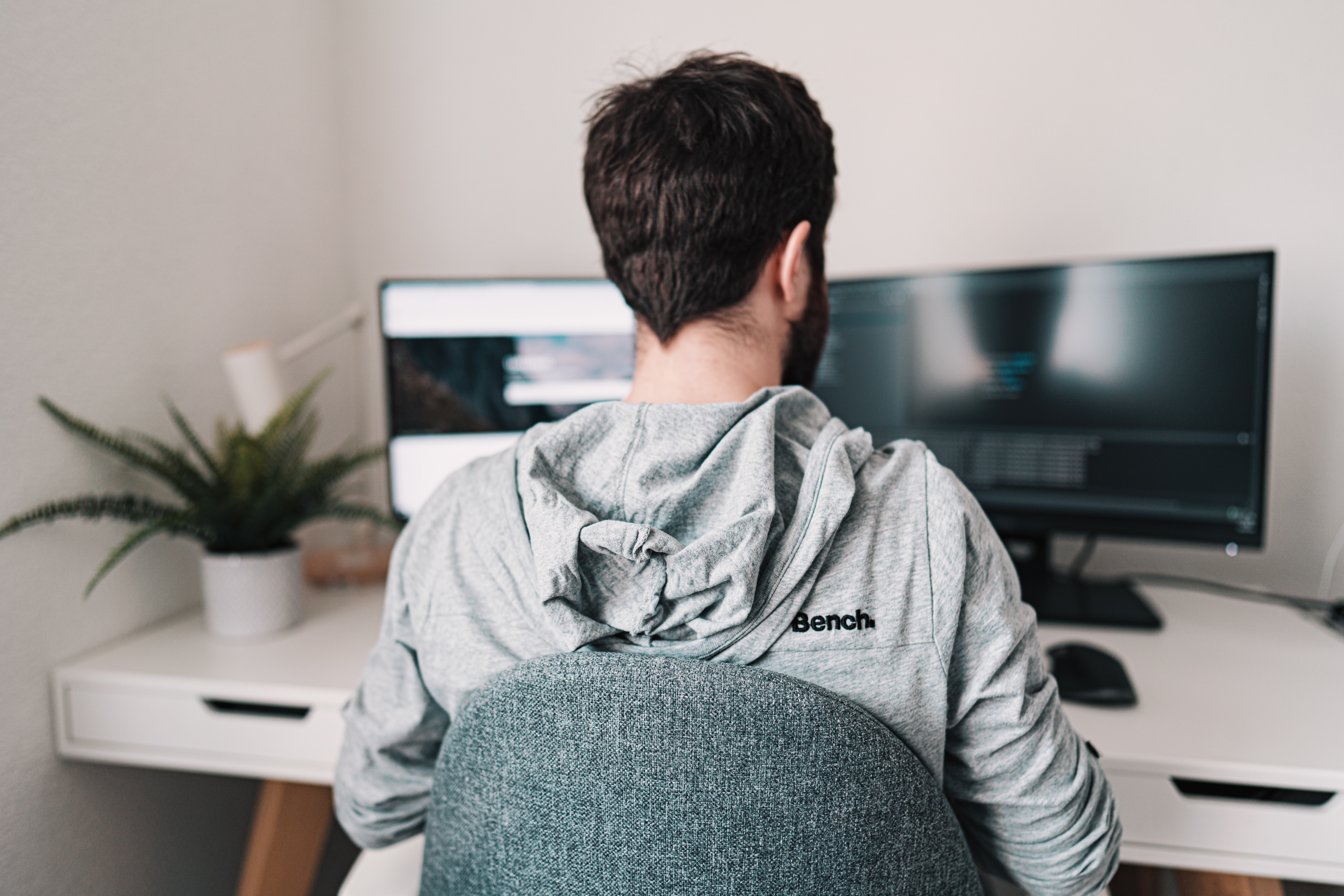
At the time of writing this article, I am typically working four days a week in the Safe Room (for use when analysing controlled data on the ONS Secure Research Service without internet access) in LIDA and one day a week from home (the latter without access to the Secure Research Service where our project and data reside).

The routine in the Safe Room is one I am still getting used to and has definitely resulted in a different and perhaps more productivity-driven way of working. This is because I work in the Safe Room alone, and with the knowledge that this is my only opportunity to access the data being used on the project. I really feel productive in the Safe Room – the lack of internet access, distractions, and even colleagues enables me to power through the research. However, I feel the burden to work, all day 9am-5pm, more keenly whilst working in the Safe Room. Whereas in normal office-based employment, I might be stewing over a coding problem during lunch or a quick break, I find that without someone to talk with, or simply get outside for a quick walk with, I miss escapism and time away from a screen, and often find myself forsaking breaks at the expense of continuing research. Before writing this blog post, I hadn’t really put this into words, so this self-reflection has really highlighted this.

Many of you might be wondering how I cope without access to the internet in the Safe Room, particularly when completing research using R. I have to say this has been the biggest challenge of the work. I liken this to completing an R exam, no notes, no internet, simply your own ability! The ONS also allows you to import code into the Secure Research Service, so if I know what I will need to do next, on my day at home I can prepare the code and ask for it to be imported. The need to leave the room to search for the particular syntax of an issue can sometimes be frustrating, but it is at the expense of access to wonderful, highly granular data. However, it does ensure I get in my steps for the day, so that’s a little win!

The single day I am currently spending at home, without access to the project space is a welcome change. The flexibility to work my hours in a different format enables me to get outdoors for a long walk during daylight, something I sorely miss inside the office. This agile method of working, provides a different focus on my home-working days and gives me the freedom to continue personal development and research any techniques or code required, providing a space for more creative thinking around the challenges encountered.  I sometimes find that within the Safe Room, your head begins to race around searching for answers and it is easy to get overwhelmed. By allowing myself time away from the screen and time outdoors, I am able to re-focus and consider how best to use the remaining 2 days in the Safe Room.

Hybrid Working – the New Normal?

Having started my first full-time post during the pandemic, I have only worked virtually, or worked alone in an empty office. This pandemic has shown that high-quality research can be completed collaboratively, remotely and across different regions – so I see no reason why this should not be a possibility moving forward. I like the agility of being able to adapt my working hours, particularly during these winter months. The ability to get outside during daylight hours really helps me, but I would also love to see some more faces in the office in the future, and hopefully meet all of my colleagues in the flesh!  Finally, I simply hope that, moving forward, working patterns will retain a level of flexibility to enable employees to find a hybrid approach that best suits them. 

Generation Rent and Supermarket Brands

Interior of an apartment - open plan living space containing lounge and kitchen

Generation Rent and Supermarket Brands

The recent Channel 5 program “Inside Waitrose” again highlighted the existence of a ‘Waitrose effect’ on the UK housing market.

But what exactly is the effect, and does it apply to homeowners and renters alike?  We asked CDRC Researcher, Dr Stephen Clark, to explain. 

What is the ‘Waitrose effect’?

The program reported work by retail analyst James O’Malley which identified the location of ‘posh’, high personal income neighborhoods and found that the top 10 poshest neighborhoods contained a Waitrose.

The most often cited study for this ‘Waitrose effect’ was conducted by Lloyds bank in 2018 that quantified the impact of various retail brands on local house prices. This study compared the average house prices in the catchment of various supermarket brands with equivalent prices from farther afield and associated the difference to the presence of the supermarket brand. They found an impact for most major brands, but the highest was for Waitrose, a +9.3% premium.

(source : https://www.channel5.com/show/inside-waitrose/)

Does having a Waitrose or M&S nearby really make such a difference?

Well, what the study did not do is try to control for the other aspects that might drive this difference, for example Waitrose stores may be located close to larger, more expensive properties than in the wider area. This means that the Waitrose effect reported may also be picking up other differences between the local neighborhood and the wider areas.

Whilst this Waitrose effect on house sales is well reported, there is less understanding of the impact of retail brands on other aspects of the English housing market, such as rental properties. This gap in knowledge is what our recent study aimed to fill.

Also, we decided to control for other aspects that make properties more desirable, such as the size of the property, the affluence and character of the neighborhood, access to services and the quality of local schools. This allows us to distill out many of these ‘confounders’ to hone in on a true retailer association.

Another aspect of our study is that we extended the understanding by examining different effects from smaller ‘convenience’ locations and more traditional larger store locations. This is important because the attractiveness of each type of location is different – the range of goods is more limited in convenience stores, but they are allowed to open for longer hours on Sundays.

What data did you use? 

For our study we used two main sources for our data. One was a database of over 1 million private rental listing prices taken from the popular Zoopla property listing site, provided by the Consumer Data Research Centre, from July 2014 to December 2015.

The second was the location of retail brands provided by the property analytics company GEOLYTIX, which allowed us to identify the location of stores, their brands and their size. Using powerful analysis software we were able to associate with each property listed for rent in England, the brand of the closest convenience store and the brand of the closest medium to large store.

Other ‘confounding’ information on the size of the property (bedrooms, bathrooms and reception rooms), the affluence of the neighbourhood (through a classification of areas and local incomes), the distance from the property ‘hot spot’ of West London, the quality of local schools and the access to transport hubs was also attached to the property. This comprehensive and diverse database on over 1 million properties allowed us to use regression analysis to measure the association of each of these aspects on the listing price of the property.

So does the ‘Waitrose effect’ have a similar impact on the rental market?

Our model produced reassuring insights. The confounding variables all estimated the correct magnitude and influence on rental prices, e.g. higher rents for larger properties, in more affluent areas that are closer to good schools and railway stations. And the retail findings were also insightful.

Convenience store 

Properties that had a convenience store within a handy 500m walking distance showed a positive impact on rental prices, after controlling for all the above confounders, over having no convenience store close by.

The biggest effect associated with a brand was for the little Waitrose brand with a 5.6% increase in rental prices. The impact for Marks and Spencer Simply Food stores was almost as high, with a 5.1% increase. The smallest increase was for a small Co-operative store of just +0.8%. Of the Big-4 retailers, the local brand for Tesco express was favored over Sainsbury’s Local stores.

Medium to large store 

Looking at the influence of which brand of medium to large store was closest to the property (irrespective of distance) and measuring this relative to the Aldi brand, we again see distinct differences by brands. The premium is always positive, meaning that all brands command a premium (all be it small in some case) over the Aldi brand.

Again the Waitrose effect is most pronounced with an associated 11.1% increase in private rental prices. With the house sales data, Lloyds bank estimates a 9.3% increase. The second highest brand is again Marks and Spencer, with an 8.7% increase. Two of the Big-4 retailers, Asda and Morrison’s only showed a small premium over having an Aldi store as the closest retailer.

One interesting finding is that Lidl, Aldi’s fellow discounter, shows a price premium over an Aldi and these two Big-4 retailers. It will be interesting to work out why this might be the case.  

Is the ‘Waitrose effect’ London centric?  

Waitrose traditionally has its roots in Southern England, particularly around London and London is recognised as an expensive location for property, both to buy and rent. This then leads us to ask are we just picking up an affluence effect from South East England for our brands?

Well, the reason we introduced the confounders was to try and capture any affluence effect in the South East using other information, such as the local income levels, the affluence of the neighbourhood, its socio-demographic make-up and critically, a distance from West London to capture in this one term the reduction in private rental prices as one moves away from West London. What is left in the variation in rents after these confounders have been accounted for is then tested against the retail brands.

What about the future?

Our study gives us a good understanding of the interaction between retail provision and rental prices in the recent past, but this relationship is clearly dynamic. Questions arise around whether in the post-Covid-19 living, working, leisure and retail landscape, will city centres and associated rental housing be less attractive and likely to remain so? Conversely, are more localised residential areas with associated small high streets now more desirable, with a knock on positive impact on convenience grocery stores and nearby rental costs? Has consumers’ experience with on-line retailing weakened the geographic link between where people live and shop – or have local in-store loyalties transferred to into the e-retailing sphere? Clearly this is an active and important area of research that is best facilitated by access to the types of novel data used here.

Do you have any plans for further work in this area?

In this study, for statistical reasons, we can only really claim an association between the retail brands in a neighbourhood and the rent for local private rental properties. To claim an actual causation requires more sophisticated statistical techniques. One technique that we are actively investigating is Propensity Score Matching which attempts to mimic a traditionally randomised control trial type experiment. Here we are attempting to set up a group of control areas (that do not have the retail brand present) and a group of treatment area (that have the retail brand present). If these two groups can be made to look ‘similar’ in every respect other than the presence of a retail brand, then any difference in the rental price may be attributed to the presence of the retail brand. Initial investigations are proving positive.


Further Information

For further information or a copy of our article, please contact Stephen Clark.

The full article is available here: Clark, S., Hood, N., & Birkin, M. (2021). A hedonic model of the association between grocery brand provision and residential rental prices in England. International Journal of Housing Markets and Analysis.

CDRC Supporting Development of Sktime

CDRC Supporting Development of Sktime

Markus Löning is a PhD student at UCL with the CDRC, and is one of the lead developers of sktime – a Python library for time series machine learning. Time series analysis is a challenging area and many existing tools do not work well with time series data. 

Solving data science problems with time series data in Python is challenging.

Why? Existing tools are not well-suited to time series tasks and do not easily integrate together. Methods in the scikit-learn package assume that data is structured in a tabular format and each row is i.i.d. — assumptions that do not hold for time series data. Packages containing time series learning modules, such as statsmodels (https://www.statsmodels.org/stable/user-guide.html#time-series-analysis), do not integrate well together. Further, many essential time series operations, such as splitting data into train and test sets across time, are not available in existing Python packages.

To address these challenges, sktime was created.

Logo of the sktime library (Github: https://github.com/alan-turing-institute/sktime)

sktime is an open-source Python toolbox for machine learning with time series. It is a community-driven project funded by the UK Economic and Social Research Council (https://esrc.ukri.org/), the Consumer Data Research Centre (https://www.cdrc.ac.uk/), and The Alan Turing Institute (https://turing.ac.uk/).

sktime extends the scikit-learn API to time series tasks. It provides the necessary algorithms and transformation tools to efficiently solve time series regression, forecasting, and classification tasks. The library includes dedicated time series learning algorithms and transformation methods not readily available in other common libraries.

sktime was designed to interoperate with scikit-learn, easily adapt algorithms for interrelated time series tasks, and build composite models. How? Many time series tasks are related. An algorithm that can solve one task can often be re-used to help solve a related one. This idea is called reduction. For example, a model for time series regression (use a series to predict an output value) can be re-used for a time series forecasting task (the predicted output value is a future value).

Mission statement: “sktime enables understandable and composable machine learning with time series. It provides scikit-learn (https://scikit-learn.org/stable/) compatible algorithms and model composition tools, supported by a clear taxonomy of learning tasks, with instructive documentation and a friendly community.”

sktime is a great example of the user community coming together to produce a understandable, compatible, standards based, open source tool to solve a specific problem. CDRC is proud to support the project through Markus’s involvement and aims to provide similar support to many other projects in the future. 

For more details, please check out this blog post at https://towardsdatascience.com/sktime-a-unified-python-library-for-time-series-machine-learning-3c103c139a55 by Alexandra Amidon (https://alexandra-amidon.medium.com/).

Understanding and Comparing Mobility Data – 4th Feb 2021

Understanding and Comparing Mobility Data – 4th Feb 2021

Through the ABC (Accelerating Business Collaboration) Research Programme, funded by ESRC & UBEL, PhD candidate James Todd worked with Geolytix to validate the representativeness of mobile mobility data from Unacast. Geolytix were interested in gaining a deeper understanding of how comparable their (Unacast) data is to alternative mobility data sources as well as insights into the factors that influence the number of devices that are found within small geographical areas.

Overall, the analysis within this project finds that Unacast mobility data is a comparable to many alternative mobility data sources, observing a 70-100% decline in activity by the start of April 2020 across the vast majority of mobility data sources.

This research project composed of 2 main methods. Firstly, a descriptive analysis of mobility trends in London were assessed by comparing Unacast mobility data to a large number of open mobility data sources (Google, Apple, Purple, Open Table, Transport for London, City Mapper, Santander Bike Sharing). Using this method, it was possible to visually compare multiple mobility data sources within the context of Covid-19 lockdown restrictions.

DatasetDescriptionSource (link)
UnacastMobile mobility dataGeolytix (private)
GoogleCategorised mobility dataGoogle (open source)
AppleCategorised mobility dataApple (open source)
SSSWifi footfall dataCDRC (private)
PurpleWifi footfall dataPurple (open source)
Open TableRestaurant reservation dataOpen Table (open source)
TfLTransport use dataTfL (open source)
City MapperMobility index dataCity Mapper (open source)
Santander Bike SharingBikeshare activity dataCDRC (open source)
Open Street MapGeographical features dataOSM (open source)
Table 1. Sources of Mobility Data used in this analysis

To enable a deeper understanding of the representativeness of Unacast data, statistical regression analysis was conducted. A fixed-effect regression was conducted to find the representativeness of Unacast mobile devices in relation to the Local Data Company’s (LDC) Smart Street Sensor (SSS) footfall data. In addition to this, a linear regression was conducted to find the relationship between Unacast mobility data to local geographic features taken from Open Street Map (OSM).

Geolytix were very happy with the project. Blair Freebairn (CEO Geolytix Ltd), said “The work is valuable to us in and of itself, but also as it has sparked additional areas of interest. In particular the comparisons to other broad brush indicators of human movement has provided context and reassurance as to the high-level appropriateness of mobility data. The micro correlations at site level are well elucidated and have shed new light on the nature of mobility data.”

James Todd, PhD candidate, said “This experience has been extremely valuable as it has given me insights into the private sector’s area of interest in the context of mobility data, which I have been working on within my PhD. This has given me many ideas on how I would like to adapt my PhD to include similar analysis as part of an empirical chapter.”

Written by Dr Nick Bearman, Project Delivery Manager

COVID for Christmas? Analysing patterns of Christmas mobility in the UK

COVID for Christmas? Analysing patterns of Christmas mobility in the UK

Examining Christmas 2020

The UK Christmas 2020 period attracted enormous public attention owing to the late cancellation of the 5-day ‘Christmas bubble’ policy to relax indoor household mixing from Dec 23rd-27th across the UK. Although Independent SAGE warned of the transmission risks from households mixing at Christmas, 44% of ONS survey respondents claimed they formed an exclusive Christmas bubble for Dec 25th.

Understanding human mobility responses has been transformed by the emergence of passively-collected smartphone app data. With most ‘Non-Pharmaceutical Interventions’ to curtail COVID-19 transmission relying upon the modification of physical behaviour [1], public health experts have called for the use of this systematic insight to monitor the effectiveness of national and regional ‘lockdown’ policies [1] [2] [3].

In response to public curiosity, and as a guide for health policymakers, this article provides a timely overview of actual mobility patterns observed over the 2020 Christmas period in the UK and their COVID-19 impacts. Using smartphone mobility data, it attempts to address:

  1. How mobile was the UK population over the Christmas period (23rd-27th Dec 2020)?
  2. Were these mobility patterns aligned with the UK government’s revised Christmas policy?
  3. Did mobility patterns have a detectable effect on UK COVID-19 growth rates?

Stuart Ross and George Breckenridge


Authors Stuart Ross and George Breckenridge are part of the Data Scientist Internship Programme at Leeds Institute for Data Analytics, which emphasises using data for the public good.

They are currently undertaking a joint 6-month research project examining patterns of mobility under the COVID-19 pandemic, funded by the Consumer Data Research Centre and supervised by Dr Mengdie Zhuang (UCL) and Prof Ed Manley (University of Leeds).

Data and Methods

For our data source, aggregated mobility data was provided by Cuebiq, a location intelligence and measurement platform. This first-party data is collected from anonymised users who have opted-in to provide access to their location data anonymously, through a CCPA and GDPR-compliant framework. Through its Data for Good program, Cuebiq provides mobility insights for academic research and humanitarian initiatives. Cuebiq’s responsible data sharing framework enables Data for Good partners to query anonymised and privacy-enhanced data, by providing access to an auditable, on-premise sandbox environment. All final outputs provided to partners such as LIDA are aggregated in order to preserve privacy.

Our metrics seek to understand mobility through the recorded ‘destinations’ of devices outside their ‘home’ location area. The ‘home’ areas of users in this analysis were calculated using a frequency-based DBSCAN from the week prior to Christmas. Destinations were then calculated daily for each unique user through a space-time DBSCAN algorithm [4]. The results of these were then aggregated in socio-temporal extent to daily and regional levels, so that the reported results protect privacy.

In order to account for relative mobility during COVID-19, a baseline of 16th December 2020 was used. Figure 1 evaluates the geographic representativeness of the Cuebiq data for 16/12/20, by visualising the UK authorities where the % proportion of the total population in the Cuebiq data outweighs (blue) the equivalent proportion from the ONS 2019 Mid-Year Population Estimates. It demonstrates that although there is good overall geographic representativeness, with no single area 1% over or under its % proportion of the total population, there is also a distinct regional geography to Cuebiq overrepresentation, concentrated in South-East England.

Figure 1: UK choropleth map to evidence representativeness by county of Cuebiq ‘GB’ data, for date 16/12/20. Calculated per county by subtracting % of total population in our Cuebiq dataset by the % proportion of the actual UK population as measured by ONS 2019 Mid-Year Population Estimates. Data Sources: Cuebiq; ONS UK Mid-Year Population Estimates 2019: https://www.ons.gov.uk/peoplepopulationandcommunity/populationandmigration/populationestimates/datasets/populationestimatesforukenglandandwalesscotlandandnorthernireland.

Policy Adherence

Under the final Christmas policy, no household mixing was permitted in Tier 4 England. Elsewhere in Great Britain the 3-household ‘Christmas bubble’ relaxations were limited to Christmas Day only. In Wales, only 2 households could mix on 25th December, whilst in Scotland bubbles were limited to 8 people.

So, did we see the spike of mobility on Christmas Day that we would be expecting, in light of these policies? No.

As Figure 2 evidences by contrast, mean distance travelled per ‘GB’ Cuebiq user actually fell in the lead-up to Christmas Day. There is a clear separation between the baseline (16th) and the entire Christmas period, with mean mobility declining by 40% from 4.5mi to 2.7mi per user on Christmas Day. Furthermore, a second smaller layer of separation exists within the Christmas period itself, within which mean mobility declined by 29% from 3.8mi on 23rd December to 2.7mi on Christmas Day. This noticeable reduction in mobility activity on Christmas Day is unexpected. Though, it is also verifiable insofar as it is reproduced in Citymapper data for Birmingham, Apple Mobility Trends Reports, and Google COVID-19 Community Mobility Reports for the UK.

Furthermore, lower mean mobility is accompanied by a higher % of users not going ‘out’ on an individual day, as well as a higher % of users staying outside their ‘home’ county. As shown by Figure 2, this is again true between both the baseline and the Christmas period, as well as within the 5-day Christmas period itself. A Multiple Comparison of Means test (Tukey HSD) showed a significant difference (P-value < 0.001) between each day’s % homestayers except between the 23rd-24th, and the 25th-26th.

Notably, the % of users outside their home county barely increased by 0.2% between Christmas Eve and Christmas Day, alongside a peak level of users not moving at 65.8%. Further than not just representing an expected Christmas Day spike, the shape of these 5-day figures relative to the 16th December baseline indicate patterns of mobility that are more closely aligned with the previous 5-day ‘Christmas bubble’ policy. On the one hand this could indicate a higher-than-expected uptake of legitimate ‘support bubbles’ for the Christmas period, or a very localised geography to the households that did mix in their scaled-back ‘Christmas bubble’. Nevertheless, these statistics could also support the speculation that adherence to the revised Christmas policy was lower than intended through the policy, with users following the withdrawn 5-day allowance.

Figure 2: Christmas Mobility for Cuebiq Users (Country: ‘GB’)
Date Mean distance
travelled (mi)
Users not
moving (%)
Users outside their
‘home’ county (%)
16/12/2020 4.5 38.8 25.7
23/12/2020 3.8 52.1 29.2
24/12/2020 3.6 52.5 35.3
25/12/2020 2.7 65.8 35.5
26/12/2020 2.3 65.8 37.9
27/12/2020 2.4 62.4 36.0

Figure 2: Visualised table documenting GB user mobility statistics, 16th and 23rd-27th Dec 2020. Includes mean distance travelled (mi, 1dp), users not moving (%) and users outside their ‘home’ county (%).  Data Source: Cuebiq.

Links to COVID-19 Growth Rate

So, did the British counties with the highest levels of recorded mobility over Christmas experience the consequence of higher COVID-19 incidence in early-January?

For this we’ve employed the proxy metric of ‘COVID-19 Growth Rate’, which is distinct from ‘R’ and is an approximation of the % change in the number of (recorded) infections each day. We’ve taken two measures of mobility from our analysis: total number of destinations visited per county and average number of destinations per individual per day per county.

The graphs in Figure 3 represent the correlations at British county level between measured mobility over the Christmas period 23rd-27th December 2020, and the COVID-19 growth rate as measured for these counties 5th-8th January 2021. As shown, the correlation for both mobility measures is positive but underwhelmingly weak. This counters our expectations that a strong positive correlation would exist.

Though plagued by small sample sizes, the top 5 counties by COVID-19 growth rate saw a dramatic spike in early January, when it was anticipated post-Christmas. Despite this, their mobility is far from the highest observed. This begs the question: were their COVID-19 growth rates a product of visitors from other counties ‘bringing COVID with them’ over Christmas? Our analysis also indicated this to be unlikely. In the two counties with useable sample sizes – Torbay and Stirling – both exhibited amongst their visitors a weighted COVID-19 county growth rate below the national average of 329, at 244.9 and 200.8 respectively. They did however both each receive visitors from one Tier 4 county that was far above the national COVID-19 growth rate average – Hertfordshire (13.5% visitors, 731) and Surrey (6.3% visitors, 603), respectively.

Figure 3: Correlation graphs per British county between Cuebiq mobility 23rd-27th Dec 2020 and COVID-19 Growth Rate for 5th-8th January 2021. Show weak correlations. COVID-19 Data Source: https://coronavirus.data.gov.uk/details/cases.

Despite this, it is very unlikely that mobility didn’t play a leading role in December 2020 COVID-19 transmission. A criticism of smartphone mobility data is that it is still unable to detect the fine-scale behaviours that can significantly reduce differential transmission risks, such as the adoption of sufficient social distancing, the wearing of face masks and whether households were definitively mixing [1] [2]. We are also forced to consider all mobile individuals as equally dangerous for transmission [1]. All factors considered, therefore, this analysis lends credibility to these critiques across a short-term period.

For further information please contact Professor Ed Manley, CDRC Co-Director and Professor of Urban Analytics at the University of Leeds.

References

[1] Grantz, K. H., Meredith, H. R., Cummings, D. A., Metcalf, C. J. E., Grenfell, B. T., Giles, J. R., Mehta, S., Solomon, S., Labrique, A., Kishore, N., Buckee, C. O., & Wesolowski, A. (2020). The use of mobile phone data to inform analysis of COVID-19 pandemic epidemiology. Nature communications11(1), 1-8.

[2] Kishore, N., Kiang, M. V., Engø-Monsen, K., Vembar, N., Schroeder, A., Balsari, S., & Buckee, C. O. (2020). Measuring mobility to monitor travel and physical distancing interventions: a common framework for mobile phone data analysis. The Lancet Digital Health.

[3] Budd, J., Miller, B. S., Manning, E. M., Lampos, V., Zhuang, M., Edelstein, M., Rees, G., Emery, V. C., Stevens, M.M., Keegan, N., Short, M. J., Pillay, D., Manley, E., Cox, I.J., Heymann, D., Johnson, A. M., & McKendry, R. A. (2020). Digital technologies in the public-health response to COVID-19. Nature medicine26(8), 1183-1192.

[4] Birant, D., & Kut, A. (2007). ST-DBSCAN: An algorithm for clustering spatial–temporal data. Data & knowledge engineering, 60(1), 208-221.

CDRC analysis uncovers new rural e-food deserts

Bananas on display at a supermarket

CDRC analysis uncovers new rural e-food deserts

A new small area ‘e-food deserts index’ (EFDI) produced by the CDRC reveals that food deserts are not solely an urban phenomenon associated with neighbourhood deprivation. Analysis reveals the presence of rural ‘e-food deserts’ – neighbourhoods that suffer a dual disadvantage of poor access to grocery stores alongside comparatively poor provision of groceries home delivery services.

The multi-dimensional composite index for GB measures the extent to which neighbourhoods exhibit characteristics associated with food deserts. It draws upon measures of accessibility to grocery retail facilities, neighbourhood socio-economic, demographic and mobility indicators and also novel measures of e-commerce availability and usage. Interactive maps highlight the EFDI scores for all LSOAs in England & Wales and Data Zones in Scotland. In common with prominent research into urban food deserts in the late 1990s, there is a clear relationship between neighbourhood level deprivation and the presence of food desert-like characteristics in urban areas.

Dr Andy Newing

Dr Andy Newing is an Associate Professor in Applied Spatial Analysis based in the Centre for Spatial Analysis and Policy (CSAP) at the University of Leeds.

Many of these neighbourhoods benefitted from considerable investment in grocery retail opportunities following the widespread interest in urban food deserts. These investments included large-format store development (such as the Tesco Extra store in Seacroft, South East Leeds constructed as part of a high profile ‘regeneration agenda’). The persistence of food desert-like characteristics in these neighbourhoods highlights the importance of characteristics such as transport availability, household composition (especially the presence of pensioners), personal mobility and income in driving groceries accessibility, all associated with urban deprivation.

The research also highlights new drivers of inequalities in access to groceries between rural areas. In East Anglia for example, the smaller cities of Cambridge (Cambridgeshire) and Ipswich (Suffolk) and the towns of Colchester (Essex) and Bury St Edmunds (Suffolk) fare very favourably on our indicator. These localities benefit from excellent local provision of grocery retail opportunities are not associated with large pockets of urban-deprivation.

The predominantly rural nature of East Anglia means that outside of these principal urban settlements, many neighbourhoods fare relatively poorly on our index, with a limited presence or choice of proximate physical retail facilities and comparatively poor transport provision. Nevertheless, ranking and scores on our EFDI index are boosted in many of these neighbourhoods by the relatively good coverage of groceries home delivery services in this area. Most neighbourhoods benefit from considerable choice in provider, with most of the major grocers offering coverage among these neighbourhoods for their home delivery services, considerably lessening the barriers to groceries access.

By contrast, in rural mid-wales almost all households fall within our worst scoring decile. Access barriers associated with very limited provision of physical retail opportunities are exacerbated by comparatively poor provision of online groceries – in most cases with no choice of retailer and potentially very limited provision of delivery slots, coupled with a low propensity to shop online among households in many of these neighbourhoods. These areas, which we class as rural e-food deserts suffer from the dual disadvantage of comparatively poor access to physical retail opportunities alongside more limited provision of online groceries (home delivery).

The index highlights the barriers in providing services within some of our most remote and rural areas, where population density doesn’t warrant comprehensive food store provision and where retailers also face considerable costs in providing groceries home delivery services to dispersed populations. We hope this indicator will help to focus attention on these inequalities. The index can be explored via interactive maps available for all LSOAs in England & Wales and Data Zones in Scotland. The data and a more detailed user guide can be downloaded via the CDRC website.

Free School Meals through a local lens – Bradford

Two primary school age females crouched over a notebook drawing

Free School Meals through a local lens – Bradford

Alex Dalton and Tom Albone are part of the LIDA Data Scientist Internship Programme and are working closely with CDRC Health and Wellbeing theme lead Dr Michelle Morris. The shared focus of their intern projects is inequalities in the local Bradford area, and one of the pressing local issues affecting this local community (as well as families nationally) is free school meals.

Following on from their previous blog ‘Free School Meals: A National Necessity’in which they demonstrated the regional inequalities within England concerning eligibility and uptake of free school meals, with the data indicating that the Northern regions have the greatest eligibility for the service. This article considers the issue locally, focussing on the Bradford district. 


Free School Meals through a local lens – Bradford  

For many, January 2021 has not started as we had hoped. Although there is widespread positivity brought by the Coronavirus vaccination roll-out, at the time of writing, a third lockdown once again means that homes have to simultaneously encompass the office and the classroom as schools are closed to all but vulnerable children and the children of key workers. The Government has agreed to extend free school meals during this third lockdown. In this second blog article we have taken the opportunity to reflect on the free school meals issue, in a more local context. 

Food insecurity and child poverty are worse in economically deprived areas. Bradford (see Figure 1) is the 6th largest city in the UK, yet it routinely reports high levels of deprivation. It is ranked the 13th most deprived local authority in England (out of 317) and the 2nd in Yorkshire and the Humber region. Between 2015 and 2019 Bradford moved up six places from 19th to 13th in the overall list, indicating its worsening situation.¹ 

The recent Born in Bradford Better Start (BiBBS) Covid-19 Survey across families in Bradford found that 18% of children said they do ‘worry about how hard it is for parents to get enough food for us’ – a shocking statistic.  

Plot showing the percentage of students eligible for free school meals per school on census day in the 2019/20 Academic Year

Figure 1. Plot showing the percentage of students eligible for free school meals per school on census day in the 2019/20 Academic Year. Plots are by Local Authority, indicating the quartiles with bw=0.1 and a uniform scale across the plots. Percentages are calculated per school using data collected by the ONS across all schools in the UK (excluding independent schools). The plot of students eligible on census day is overlayed with the plot of students recorded actually taking free school meals on the census day (translucent violin plots).

Within Yorkshire and the Humber, a breakdown of students eligibility by Local Authority allows a comparative understanding of the Bradford area. Our analysis uses government data across all schools, excluding independent schools, for the 2019/20 Academic Year, see Figure 1.  

Comparing the shapes of the violin plots, it is clear that the number of students eligible per school ranges drastically between local authorities, as it does nationwide. The shorter plots (such as North Yorkshire) indicate that the schools in that area all have a similarly low eligibility. In contrast, taller plots (such as Sheffield) indicate that there is a high number of schools in the area with a high percentage of eligible students.  

Bradford schools reported a similar mean eligibility across its schools (20.5%) to the statistics for the Yorkshire and the Humber Region (19.5%). The importance of free school meals in the area jumps out when looking at quartiles: a widely-used statistical measure marking out points in the distributions shown on the plots by dashed lines. 

Looking at the distance between the lower and upper dashed lines for each Local Authority, Bradford can be seen to have a large range of eligibility in its schools. Each dashed line (quartile) progressively marks a quarter of the data, when ranked from lowest to highest. Thus, the large distance between these outermost dashed lines shows values range greatly across most schools in the area. 

Bradford schools reported a similar upper quartile (27.4%) to the statistic for the Region (27.4%). However, the middle (19.8%) and lower quartiles (11.7%) for the area are both higher than the Regional averages (16.5%) and (8.5%). These higher measures imply the majority of schools in Bradford have a higher likelihood of children needing free school meals than the majority of schools in the Region.  


Regional variations exist. What about neighbourhood variation? 

In this map of Bradford (figure 2), local variation in eligibility and uptake is clear. The more populated southeast of Bradford has several wards where the percentage of children both eligible andof those eligible, taking free school meals on census day is relatively high.   

Figure 2 - Bivariate map showing percentage of children eligible for free school meals and of those, who took one on census day. School data has been aggregated to ward level.

Figure 2 – Bivariate map showing percentage of children eligible for free school meals and of those, who took one on census day. School data has been aggregated to ward level.

The school data has been aggregated into wards and gives some indications as to which areas of Bradford contain schools attended by children for whom food security is a concern.  The results are not unexpected given that 14 out of 30 Bradford wards are amongst the 10% most deprived in England (shown in bold in Figure 4). The two variables have a strong positive correlation, for example where there are high percentages of children eligible, a higher percentage of those children took a free school meal on census day.  It is important to note that the data used here reflects what happened on census day, considered a ‘normal’ school day.   

At a more granular level, the same spatial patterns can be seen across Bradford with graduated symbols.  In Figure 3, larger icons represent schools with a higher percentage of pupils that are known to be eligible for free school meals. The areal units underneath the schools are Lower Super Outputs Areas (LSOA) showing relative deprivation across England by decile. There is a clear relationship between more deprived areas and higher levels of free school meal eligibility. 34% of Bradford’s LSOAs fall within 10% of the most deprived neighbourhoods in England, whilst 16% fall within the least deprived, showing a stark contrast and potential for inequalities experienced by residents across the district. 

Figure 3 - Map showing schools in Bradford classified by percentage of children who were eligible for free school meals and made a claim on census day. Schools appear over the top of the English Indices of Multiple Deprivation 2019.

Figure 3 – Map showing schools in Bradford classified by percentage of children who were eligible for free school meals and made a claim on census day.  Schools appear over the top of the English Indices of Multiple Deprivation 2019. 

Figure 4 – Map showing schools in Bradford classified by percentage of eligible children who took a free school meal on census day.  Schools appear over the top of the English Indices of Multiple Deprivation 2019. 

Higher levels of eligibility are frequently used to allocate additional funding and interventions for children and can often be a proxy for deprivation (as eligibility is tied to income).  However, as with many demographic and socioeconomic measures, the underlying picture is most likely far more complex. Less than half of the children eligible (and who have already been claimed for) took advantage of free school meals, indicted by the maximum percentage of 43% (Figure 6).  The same spatial patterns occur when compared to eligibility in Figure 3, however the interpretation of such patterns is different. For example, schools in more affluent areas have a lower percentage of eligible pupils having a free school meal. There could be many reasons for this other than underlying demographics, such as an urban/rural split or size of school.  

Research has found that stigma plays a large role in impacting whether children who are eligible use the service or not.²  Anonymity is considered one of the best solutions to this problem, with the traditional method of providing vouchers that are handed to catering staff being identified as one reason children are so reluctant to take a free school meal.³ 

We cannot conduct analysis or reach any conclusions on stigma based on our data, however we can see that in less deprived areas, there was a lower percentage of eligible children taking free school meals on a ‘normal’ school day.  Whether this was because stigma is felt more keenly where a child may be one of a much smaller number eligible is unclear, but it is certainly worth considering.  It is important to note that eligibility measures only consider those who have made a claim for the service. 


What can we learn looking forwards? 

Worsening food security is another of the unfortunate consequences of the COVID-19 pandemic. The issue of whether to extend free school meals into the holidays has taken centre stage in the national conversation on several occasions. There are areas of high relative deprivation where free school meals are a necessity for a large percentage of an individual school’s population. Although the Government has changed its policy in response to sustained campaigns, using data to understand the local and national landscape with respect to free school meals will help inform more proactive and timely decision making.  

Bradford is just one instance of a highly disadvantaged region in the UK, where food access is one of the many issues for struggling residents. The most deprived areas in Bradford contain schools with higher percentages of pupils both eligible for and taking free school meals. This indicates the need for continued support in these communities, in order to minimise food insecurity. These areas will be significantly more disadvantaged and face serious financial pressures over winter, particularly over this uncertain period. 

If we can promote change in this area, it would then positively impact many outcomes in children’s lives later down the line. Systems must be put in place to combat food insecurity imminently. It is important for local authorities, such as Bradford, to have adequate resources to continue to provide free school meals to pupils when schools are closed due to COVID-19In 2021, the Government’s extension of free school meals over the school holidays and closures needs to be the first reality of a resolution to get our children the necessities they deserve. 

¹ https://ubd.bradford.gov.uk/about-us/poverty-in-bradford-district/
² https://www.iris.co.uk/blog/children-reject-free-school-meals-because-of-stigma/
³ Holford, Angus. (2015). Take-up of Free School Meals: Price Effects and Peer Effects. Economica. 82. 10.1111/ecca.1214

Free School Meals: a National Necessity

Two primary school age females crouched over a notebook drawing

Free School Meals: a National Necessity

Alex Dalton and Tom Albone are part of the LIDA Data Scientist Internship Programme and are working closely with CDRC Health and Wellbeing theme lead Dr Michelle Morris. The shared focus of their intern projects is inequalities in the local Bradford area, and one of the pressing local issues affecting this local community (as well as families nationally) is free school meals.

In this guest blog they have collaborated to discuss this issue, and the data available, in more detail. This article details the uptake of free school meals across the nation, looking to this Christmas period. A second article will follow which covers the issue in local area of Bradford.

Why are free school meals needed in the UK?

Access to affordable and nutritious food is a growing problem in the UK. Since 2008 the use of foodbanks has been increasing [1], and the impact of government austerity measures have become apparent with levels of child poverty and food insecurity escalating.

As the economic ramifications of the Coronavirus pandemic emerge from the depths of the initial health scare, businesses are closing across the UK and there has been a record spike in redundancies.  Individuals and families alike are suffering emotionally and financially.

Financial status is a key indicator of food insecurity. Studies have shown how devastating household food insecurity is for health, social well-being, and child development1. Free school meals provide children with vital access to food. Vital in the immediate sense (hunger) and with longer-term consequences (poor health outcomes).

This article explores the uptake of free school meals in the UK, particularly within areas suffering from high levels of deprivation.

The UK has been reported as one of the worst-performing nations in the EU for food insecurity, with 19% of children under 15 living with food insecurity [2].

This is highlighted by the increase in uptake of free school meals: the government incentive to tackle the effects of food insecurity in children and young people. In recent months, the necessity of free school meals has been heavily discussed in the public eye and in government policy.

The UK government’s decision not to extend the free school meal scheme across school holiday periods since lockdown started has proved contentious. The drastic widening and deepening of food insecurities [2] [3] as a result of the Coronavirus pandemic and associated lockdowns resulted in the issue receiving a lot of public attention. Marcus Rashford, a professional football player, rallied support from the public and incentivised businesses’ donations.  The surge of support and speed of response succeeded in raising £20million to feed children in the UK and demonstrated how crucial the free school meal scheme is for children to access food in the UK.

Eligibility for Free School Meals in the UK

The percentage of students known to be eligible for free school meals has been rising year-on-year. Since 2018, the percentage across all schools has increased from 13.6% to reach 17.3% of students eligible in 2020.

To further understand the proportion of students relying on free school meals across all the UK, it is useful to look at the distribution of eligible students for the scheme per school.

The following analysis uses data recorded by the Office for National Statistics for the 2019/20 Academic Year. The data is recorded across all schools in the UK, however for our investigation independent schools have been excluded from the dataset as they do not appear to record free school meal data.

Figure 1. Plot showing the percentage of students eligible for free school meals per school on a census day in the 2019/20 Academic Year. Plots are per Region, indicating the quartiles with bw=0.1 and a uniform scale across the plots. Percentages are calculated per school using data collected by the ONS across all schools in the UK (excluding independent schools). The plot of students eligible on a census day is overlayed with the plot of students recorded actually taking free school meals on the census day (translucent violin plots). The darker edges showing those who did not take their free school meal.

It is important to note that the data refers to children who were eligible to receive, and who claimed, free school meals (FSM) by census day. The overlay of students recorded as taking FSM refers to eligible children who took a free school meal on census day. This second measure only provides an indication of what happened on the day of the census. However, for the purposes of this blog we can use them as an indicator of the proportion of those eligible that needed to use the service.

The distributions show that a significant proportion of children rely on free school meals across the country. More interesting is the variety of the distributions between Regions, illustrated by the shapes of the plots.

Northern Regions have a larger number of students that are eligible per school. Three quarters of schools (top dashed lines on plots) in the Northern Regions (e.g. North East, Yorkshire and Humber) have up to 30% of students eligible on average, with a spike of 36.5% in the North West illustrating that free school meals are more commonplace and required in these areas. In contrast, three quarters of schools in the Southern Regions (South East, South West, East of England) never exceed 20%.

The long thin violin plots, such as that of the North East show that the percentage of students eligible in schools ranges drastically across the region, with some schools having a particularly high proportion of eligible students. In comparison, the short ‘dumpy’ violins indicate the majority of schools have a similar proportion of eligible students, which here tends towards the lower end of the scale, illustrating the stark differences across the UK and inequalities in food security.

What can we learn looking forwards?

Food banks in the Trussell Trust network had been seeing year-on-year increases in levels of need; in a recent report they stated that:

“This (COVID19) crisis has landed after years of stagnant wages and frozen, capped working age benefits – leaving those on the lowest incomes vulnerable to income shocks”.

With children having spent a great deal of time off school during lockdown at home, pressures on family budgets have increased. During this time, efforts were made to provide families with free school meals despite the schools being closed. Even though this was seen as an essential need for many, it was not provided by the government until public opinion went against them.

With the economy taking hit after hit, those in the most deprived households are more likely to suffer the worst impacts. Recent data from a YouGov survey suggests that many households have fallen into food insecurity since the advent of the Covid-19 pandemic. More than three million people (6%) in the UK went hungry in the first 3 weeks of ‘lockdown’, with households reporting that a member had been unable to eat, despite being hungry, because they did not have enough food. Permanent or temporary unemployment appears to underlie lack of resources, with claims for Universal Credit approximately doubling since mid-March 2020 [4].

The demand for free school meals to be provided over the school holidays is driven by the extraordinary circumstances we all now find ourselves in.

These data let us see how issues of food security and free school meals disproportionately impact some areas more than others. As with the rate of COVID-19 infections and the government restrictions, it is useful to look at this on a local level. The city of Bradford is one such example and will be the focus of a further article.

[1]  https://www.trusselltrust.org/wp-content/uploads/sites/2/2017/07/OU_Report_final_01_08_online2.pdf

[2] Barker, M., & Russell, J. (2020). Feeding the food insecure in Britain: learning from the 2020 COVID-19 crisis. Food Security, 12(4), 865-870.

[3] Power, M., Doherty, B., Pybus, K., & Pickett, K. (2020). How COVID-19 has exposed inequalities in the UK food system: The case of UK food and poverty. Emerald Open Research, 2.

[4] https://www.nihr.ac.uk/documents/2048-food-insecurity-health-impacts-and-mitigation/24905

New Data: The e-food deserts index

New Data: The e-food deserts index

The e-food deserts index (EFDI) is a multi-dimensional composite index for GB which measures the extent to which neighbourhoods exhibit characteristics associated with food deserts across four key drivers of groceries accessibility:

· Proximity and density of grocery retail facilities

· Transport and accessibility

· Neighbourhood socio-economic and demographic characteristics

· E-commerce availability and propensity

It draws on a long interest in food security among Geographers and policy makers, most prominent in the late 1990s and early 2000s ‘urban food deserts’ debate. At the time it was argued that urban food deserts had been ‘abandoned’ by the major grocers, resulting in poor access to the larger format grocery stores which provided fresh, healthy and affordable food. Many of these neighbourhoods were some of the most deprived in England and Wales and were located within inner city areas where residents faced considerable financial and practical (e.g. access to transport) barriers to accessing food store provision.

The EFDI incorporates new indicators of online groceries (home delivery) provision and propensity to engage with online groceries, the latter drawn from an existing CDRC data resource, the 2018 Internet User Classification. In addition to urban deprivation, it highlights a new driver of inequalities in access to groceries, termed ‘e-food deserts’ – remote and rural neighbourhoods which suffer the dual disadvantage of comparatively poor access to physical retail opportunities alongside limited provision of online groceries.

The EFDI is constructed at a neighbourhood level using Lower Super Output Areas (LSOAs) in England and Wales and Data Zones (DZs) in Scotland. Input data are drawn from a range of sources including the Census and existing indicators of deprivation and accessibility at the neighbourhood level. It also incorporates a number of custom-derived indicators of food store accessibility, consumer behaviours and availability of groceries e-commerce drawn from our own modelling.

The index can be viewed on CDRC Maps (England and WalesScotland) and is available to download for researchers and policy makers to attach to their own data. The research team would be very keen to understand how the index has been used in subsequent applications.

Screenshot of Newcastle showing the EFDI at Lower Super Output Areas
Newcastle upon Tyne – users can search the EFDI by location on CDRC Maps

The research team have used the index as input to wider ongoing work into geographical inequalities in e-groceries provision as part of the first GB wide assessment of the geography of online groceries provision. Whilst they found that online groceries coverage is generally excellent at the household level, they note considerable inequalities in online groceries provision between urban and rural areas. Whilst online groceries could afford considerable potential to improve retail access in rural areas, inequalities in provision are currently driving new notions of contemporary food deserts.

Andy Newing, Associate Professor in Applied Spatial Analysis at the University of Leeds, who led this study, said:

“These inequalities in online groceries delivery availability are driven by the challenges of providing services within out most remote and rural areas, alongside the predominantly urban and suburban nature of investment in e-groceries by retailers.”

Recounting Crime – helping to improve the accuracy of crime estimates

Recounting Crime – helping to improve the accuracy of crime estimates

Recounting crime is a research project funded by the ESRC Secondary Data Analysis Initiative. The project team are using data from the CDRC to explore new statistical methods to help improve the accuracy and precision of crime estimates.

About the Project

Getting an accurate picture of the true extent of crime is a central task of police forces, the Home Office, and Office for National Statistics. Annual counts of crime are used to determine the costs of crime, which is in turn used to allocate resources to the police and public services, performance manage the police, and evaluate crime reduction initiatives.

The regular publication of crime figures is also a key determinant of public confidence which in turn facilitates greater reporting of crime, whilst also being used by governments to justify – and retract – major policy initiatives. Recent reports about the rise of knife crime, and the large uptick in hate crime post-Brexit both relied on close reference to crime statistics, and the proposed extension of stop and search powers across police forces in England and Wales has also been justified with reference to these apparent increases in crime.

The problems with recorded crime figures are well known, including inconsistencies in recording practices in different forces, incentives to ‘no-crime’ incidents that are unlikely to be solved, and differences in the willingness of the public to report certain crimes (which is itself dependent on the relationship between the police and the public). So severe are these problems that police recorded crime figures recently lost their official statistics designation (following a substantial review in 2014). 

In this project the team will make use of recent developments in the study of measurement error and small area estimation to better understand the nature of the gaps in coverage of the two sources of crime data, explore the implications of relying on crime estimates prone to measurement error, develop adjustment methods and estimate new ‘corrected’ crime counts at the local area level. 

Find out more

Visit the Recounting Crime website.

Follow Recounting Crime on Twitter.

Watch the Recounting Crime project team discuss the impact of measurement error in police crime records at the UK Data Service – Crime Surveys User Conference 2020 on 8 December.